#tldr We’ve added extensive documentation around the creation of Design Systems with kickstartDS. From general intro, foundation articles and component example guides to our main guide “Create your Design System”… explaining every single step of the process in detail. And for everyone wanting to dive in head first, we’ve added an extensive, best-practice Starter as a Github template! Clone it and kickstart your Design System in just 5 minutes!
Documentation
The third big pillar of our Open Source release is our documentation (read about Semantic Token in Release Spotlight 1/3, or Container Queries in Release Spotlight 2/3).
Why is documentation so important to us? Because we know that just putting your code on GitHub, even using a fitting LICENSE, will not be enough if we really want people to take a serious look… and even more so if considering adoption.
Additionally, Design Systems need you to take a lot of decisions. Those can be both highly custom and opinionated. This is why we think explaining our reasoning in detail, especially when we take decisions for you (like using Style Dictionary), is super important. And for areas where there is no clear cut decision to take, we always try to add recommendations (like how to best construct your components to avoid adding technical debt) instead.
Intro and Getting Started
The “Introduction to kickstartDS“ page, also the index page for the “Getting Started” section, features a short video of us introducing kickstartDS, defines features and aspirations, and introduces the motivation behind creating kickstartDS.
Next to that, this section is mainly about giving you a first, good understanding for the context you’d work in when building on kickstartDS. This includes talking about release handling and upgrade processes, the environment involved, how our CLI works, or what packages exist to choose from.
It also describes the next steps you could take, after deciding if what you’ve read is to your liking.
Create your Design System guide
“The guide” ™️, where we try to explain the process of creating your Design System atop kickstartDS in detail. Starting from scratch (seriously: an empty directory!) we build up everything needed to have your first Design System release published, ready to be consumed by others!
As the guide is quite lengthy, we broke it up into 5 main parts:
- Start your Design System
- Design Application
- Configure Storybook
- Add Components
- Publish your Design System
All the code involved with the guide is also available on GitHub (there’s one branch per step) for quick referencing, and included in Code Sandboxes alongside the major guide sections.
Additionally, our Starter includes the exact same components created here. This makes the guide a great reference if you’re not feeling like following lengthy instructions, but would still prefer a place to look up implementation choices “on demand”.
Foundations
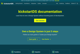
Our “Foundations” section describes the basic aspects of all main areas you can find in a Design System, especially when combined with the choices made in kickstartDS to be built upon.
Learn about Branding Token, Design Token and Component Token in the “Token” part, the layers of components in “Components”, how to handle “Layout”, and which “Modules” (collections of components) exist.
You can find all of those categories on the foundations index page.
Design Token additionally contain distinct pages per token category (Color, Typography, Spacing, Border, Shadow, Depth, Breakpoints), while the layout section includes a selection of examples, ready to copy and paste… both for the Section component included with kickstartDS and our recommendation for more general layout needs in Bedrock Layout Primitives.
Integration
Every Design system lives and fails with its success in being applied in real projects, the ones actually generating tangible value.
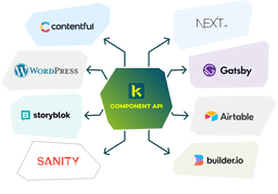
Making the application of your Design System as effortless as possible necessarily involves integrating with other frameworks, tooling, processes, libraries and technologies. Regardless of whether you are integrating HTML into your backend (written in e.g. PHP, ASP.NET, Ruby on Rails, etc), or alternatively using React templates directly… combining headless CMS and APIs through something like Gatsby or Next.js, integrations can really speed up that adoption process.
We also try to integrate really well out-of-the-box with popular tooling for Design Systems. First and foremost this means providing the best workbench experience possible using Storybook. Be it using addons we’ve written ourselves for JSON Schema support or Component Token, or adding best-practices and configuration you can easily adopt.
Guides
This is the meat of our documentation! We try to provide detailed guides here, each focused on a particular topic. Main topics currently include: Components, Examples, Migrations, Using our Starter and the Design System Initiative.
One special mention should be awarded to our main guide “Create your Design System”. With that one you start with an empty folder, and build up your Design System piece by piece… always accompanied by explanations. This is the perfect start to learn everything from the ground up!
The main guide also provides a great segue to our kickstartDS Design System Starter. If you don’t feel like following a lengthy guide, and prefer to get going with some code immediately, it is the most efficient way of starting your Design System. It contains the exact same code described in our component examples, and said main guide, so those can provide a great reference when going down that route. It is ready to be cloned on GitHub as a template repository, so you could have your own Design System open in your browser in 5 minutes max!
Design System Starter
Our Design System Starter is the perfect starting point if you want to get going immediately. You get everything described in our guides… and some really nice and helpful integrations (like Bedrock Layout Primitives, Bundling, Playroom, Releases) on top of that.
Initial setup only includes 5 super simple steps, that should be done within just 5 minutes, leaving you with a great foundation to start your real Design System work!
Features
The main features included with our Starter:
- Ready-to-start, fully functional Design System
- Pre-configured, Semantic Token structure (Branding Token, Design Token, Component Token)
- Branding Token file for quick application of CI / CD
- Three exemplary components (“Button”, “Headline” and “TeaserCard”) and a layout element (“Section”)
- Full page demo, recipe demo and rudimentary demo docs
- Storybook with best-practice configuration, kickstartDS integration
- Hot reload for all code changes: Design Token set, JSON Schema, CSS / SCSS, JavaScript and React templates
- Playroom integration for prototyping
- Bundling of Design System for use with and without React
- Automatic, semantic release handling using auto
- CI / CD integration for Circle CI
Getting Started
Getting started means following the following 5 steps:
This hopefully gives you an idea on why we think this should be possible in just 5 minutes!
Result
After successfully cloning the Starter, and following the Getting Started, you’ll be left with a Design System ready to be added to!
Where exactly you take it next is pretty much up to you completely. There are some things one would pretty much always want to do (e.g. Customizing Design Token), while others might be optional. In which order you tackle those shouldn’t make a difference, just choose what fancies you the most!
You can also have a look at the “Next steps” section of the Starter docs, which give some more detailed pointers on what could come next (for example starting a Design System Initiative)
Feedback
We’d love to hear your feedback! Doesn’t matter if you only found a typo in our docs, or maybe your Design System journey came to a screeching halt when following our main guide, or just want to leave some warm words!
Feel free to join us on Discord!
If that’s not your cup of tea, you can also reach out to us:
- Through the chat widget, included in all of our public facing websites
- By writing us an email
- By joining us on Twitter
- By writing us on WhatsApp


