


#tldr: Design Token are all the rage these days. In almost every channel from the Design System space, you can feel a crispy white noise around the broad topic of Design Token. We also put in a lot of effort when refactoring our Token structure in kickstartDS for our latest release. It might look over-engineered on a first glimpse, but we understand ourselves as a meta framework for Design System creation and therefore want to provide you best practice defaults.
Branding, Design & Component Token
Token are the smallest building blocks of a Design System. Based on the values they store, they are usually used across multiple tools and platforms to ensure consistency and matching brand identity. kickstartDS differentiates between Branding, Design and Component Token. Whereas Design Token store values e.g. color, typography, spacing, animation, etc., Branding Token come in handy offering a structured approach towards applying your company’s brand identity or corporate design at one single spot with maximum efficiency. Component Token represent the properties and values that are contained in a component, e.g. controlling how its container, label text, icons, and states look.


Since we are publicly open source now, the great thing is, that you can check out that structure on your own in our repo.
We fully rely on semantic token within kickstartDS
With this release we implemented semantic token, which is a rather modern concept that mainly involves naming tokens by their intended use. Some teams refer to these with names like alias tokens or purpose tokens, all describing basically the same concept of including intention in the token name, in comparison to just naming it by its current value (like “color-red”).
Example: $background-color-success vs $background-color-green
I don’t want to go into more detail in this post, as these concepts are already very much explored by well known people from the community 😉
For example Nathan Curtis article:
https://medium.com/eightshapes-llc/naming-tokens-in-design-systems-9e86c7444676
Other valuable reads are from Lukas Oppermann and Dannie Damato
https://uxdesign.cc/naming-design-tokens-9454818ed7cb https://blog.damato.design/posts/tokens-as-intents/
Base scales vs Semantic Token
As described in the paragraph above semantic token are the concept we apply when building components, whereas base scales are another concept we use as the input for your semantic token. You choose your semantic token from a set of base values and scales, think of those as the painters palette, making sure there’s a lot of re-use (aliasing) in your Design Token. In turn enabling efficient, consistent changes to your semantic token. There are scales for different kinds of token, such as color or spacing for example. A base scale for these token is generated by default. You can edit the scales when applying to fully match your brand’s identity.
Structured token following Style Dictionary format
Taking the code perspective: token in kickstartDS are structured using JSON, following the Style Dictionary format. Style Dictionary is an Open Source tool developed by Amazon that allows you to define styles once, in a way for any platform or language to consume.


With Style Dictionary you can manage Design Token and organize them into collections of JSON files. In addition, you can export those organized tokens to many platforms, tools or integrations by using its so-called transform groups to generate technology-specific formats or deliverables.
Side note: we are eagerly awaiting the release of the W3C Design Token Group format, with the intention with following it whenever it is finally decided.
Using such an established approach with Style Dictionary in the meantime allows to benefit from its general community adoption, a lot of extensions, plugins and automation already being written for you.
Themes for Bootstrap, MaterialUI, TailwindCSS, Fiori and others
Facilitating Style Dictionary, we can use its transform groups to derive and generate themes for 3rd party component libraries such as Bootstrap, MUI or even SAP Fiori. We are working on ready-to-use examples to help you distribute your Design Token and assets into these environments. We’ve started with early tests on this, but the goal is to provide ready-made configurations. Giving you a great starting point by having best practice connections between themed solutions like MUI and your Design Token.
Style native mobile Apps through token
As you might have noticed already most of that transformation-stuff is made possible by Style Dictionary. Hence, similar configurations can be set up to apply token for their usage in native apps in Android or iOS.
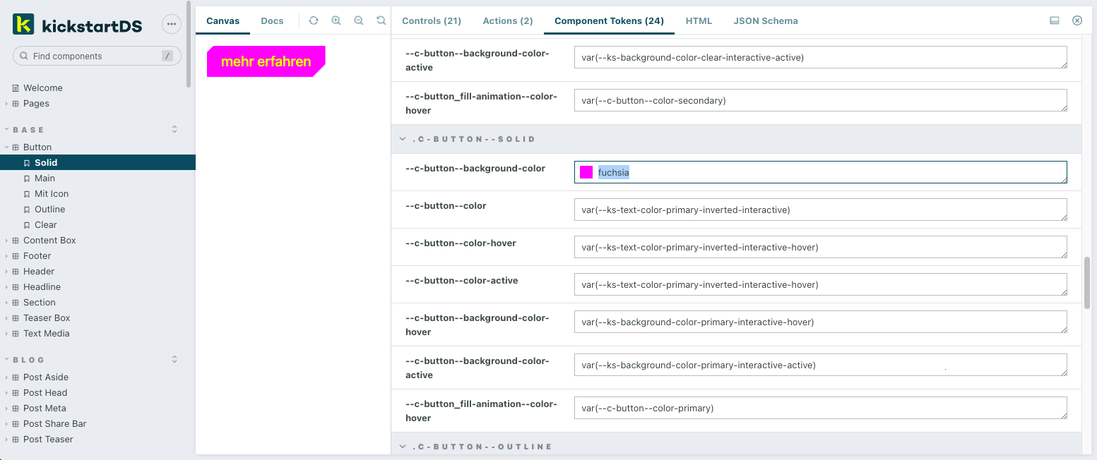
CSS Custom Property transform group
Custom properties are the bedrock of our component implementation when it comes to encoding design and layout. We transform your Style Dictionary into a set of those CSS Custom Properties, which are then layered onto components in the form of Component Token. So a “Button” may use one semantic color token for its label text by default (“–ks-text-color-interface-interactive”), but in a different variant an “AlertButton” might be specifically layered with a semantic color token signifying a problem (one based on “–ks-color-negative”), while still re-using the rest of the default “Button” token mapping.
Synchronization of Design Token from Figma
Since Figma still does not offer a full, native integration or treatment of Design Token, we are working on a synchronization from Figma to JSON. You might be familiar with the Figma Token plugin or tools like Specify for this dynamic exchange between design and code. We are currently working on a solution, as a perfect addition and fit for the Token structure in kickstartDS, to also make this part of the design process efficient and easy like squeezing a lemon. Unlike hassling around with configurations to be adjusted, or concepts not quite fitting your intention, this will be opinionated and tailor-made to the way we’ve approached token in kickstartDS.

Multibrand-theming and layering with kickstartDS
You can declare Design Token for each of your brands/themes within a layered instance of kickstartDS. You or your DesignOps team can specify which component for which brand should be based on the core components, or instead be fully customized for that specific use case… keeping it from polluting the (shared) core.
And if it’s just another layer of paint for one of your sub-brands, you can even get away with just defining an additional token set. No further coding required!
Make it yours!
In reference to what I wrote in the intro of this post, kickstartDS is meant to be a meta framework for Design System creation.
Start by applying your branding and corporate design to kickstartDS in roughly two steps:
- Use a reduced set of Branding Token to generate your initial Design Token set
- Fine tune the resulting Design Token set to closely fit your corporate identity
Once your Design Token are generated, the Design System will already have the broad look and feel of the targeted Corporate Design. However, you probably still need to tweak some little details to make it match up perfectly with your brand requirements.
More than just adapting token, you should also adapt our base components and start making them your own. By default our components come with a huge set of properties. You choose which of these props you really need, how you want to name them, and thus how you want to synthesize it towards your own requirements. You can also create wholly new components based only on following kickstartDS’ systematic approach, without actually using base components.
Ultimately, adapt and make the default process yours
We propagate code first, when talking about the source of truth of Design Systems. Users interact with coded components, not with the (Figma, Adobe XD or Sketch) design files which are often the starting point for exploration of the component use cases or even full-page layouts to be adopted by the developers.
Depending on which handover process you have implemented and how deeply designers interact with developers, handling Design Token through Style Dictionary generates high value for both parties. It gives designers the power to keep owning their design decisions, as developers usually, for example, do not like to decide which color to use (one more reason to rely on semantic tokens). Those decisions then will be transformed into JSON, which makes those files the ultimate source of truth, working in both directions.
Try it now
I hope that we could tickle your curiosity and light up the desire to try it out on your own. The best place to start are our docs, which might get their own Release Spotlight soon.
https://www.kickstartds.com/docs/guides/create/
If you have any questions, just join our Discord community or drop us an email to hello@kickstartds.com


