
Theming

There are some limited options to theming Storybook. But while this might seem like a small thing, it can really help make your Storybook feel like home.

To learn more about theming in Storybook, have a look at their dedicated docs for that.

Usage with kickstartDS

You already have a well established Design Token set when working with a Design System based on kickstartDS. In our mission to always provide sensible defaults, that improve your status quo without a big upfront investment of time, we provide a transformer in our Style Dictionary implementation (it's the tool backing your Design Token set). That transformer takes your Design Token set and converts it to JavaScript values that can be imported in Storybooks theme file (.storybook/themes.js).

As this is a generated file, based on your configuration, it's content will vary, but it should a little like this:

.storybook/themes.js

_38
import { create } from '@storybook/theming';
_38
import * as tokens from '../src/token/storybook/tokens';
_38
_38
export const light = create({
_38
base: 'light',
_38
_38
colorPrimary: tokens.KsColorPrimaryBase,
_38
colorSecondary: tokens.KsColorPrimaryBase,
_38
_38
// UI
_38
appBg: tokens.KsColorPrimaryToBg9Base,
_38
appContentBg: tokens.KsBackgroundColorDefaultBase,
_38
appBorderColor: tokens.KsColorPrimaryAlpha2Base,
_38
appBorderRadius: tokens.KsBorderRadiusCard,
_38
_38
// Typography
_38
fontBase: tokens.KsFontFamilyInterface,
_38
fontCode: tokens.KsFontFamilyMono,
_38
_38
// Text colors
_38
textColor: tokens.KsTextColorDefaultBase,
_38
textInverseColor: tokens.KsTextColorDefaultInvertedBase,
_38
_38
// Toolbar default and active colors
_38
barTextColor: tokens.KsColorPrimaryAlpha6Base,
_38
barSelectedColor: tokens.KsColorPrimaryBase,
_38
barBg: tokens.KsBackgroundColorDefaultBase,
_38
_38
// Form colors
_38
inputBg: tokens.KsBackgroundColorInterfaceInteractiveBase,
_38
inputBorder: tokens.KsColorFgToBg7Base,
_38
inputTextColor: tokens.KsTextColorInterfaceInteractiveBase,
_38
inputBorderRadius: tokens.KsBorderRadiusControl,
_38
_38
brandTitle: 'Your kickstartDS Storybook',
_38
brandUrl: 'https://www.kickstartDS.com',
_38
brandImage: '/logo.svg',
_38
});

This automatically connects your Design Token set to your Storybook theme, while also setting your logo.
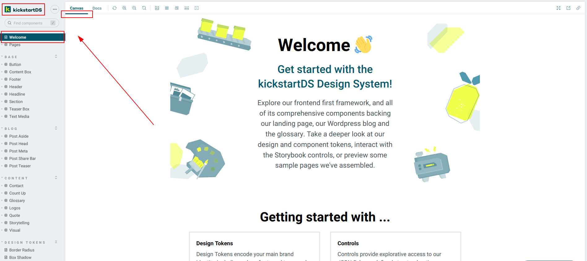
Example

Have a look at our very own kickstartDS instance to see our colors (as an example) at work:

Image showing our corporate branding used to theme Storybook

To learn how to use this in your own Storybook, have a look at part three of our "Create your Design System" guide for an in-depth explanation.