Design & Component Token
Design Token Integration
To display your Design Token set in Storybook we use and recommend the storybook-design-token addon. We also include a format for Style Dictionary, which outputs your Design Token set into a specific CSS Custom Properties format, annotated with the token presenters as needed by storybook-design-token.
For an example on how this needs to be configured, have a look at the chapter "3. Configure Storybook" of our "Create your Design System" guide.
We also provide ready-to-use docs pages for Storybook, using the DesignTokenDocBlock by storybook-design-token, mapped to our semantic Design Token categories and values.
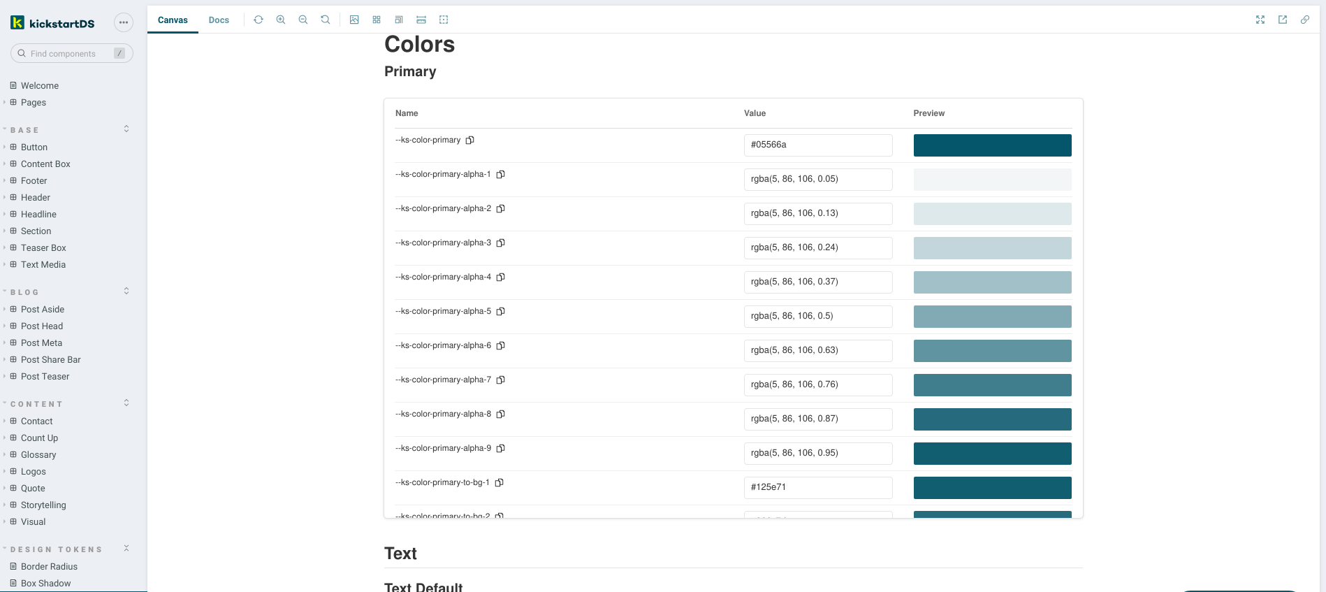
You can find those in our mono-repository, or have a look at them in action on our own hosted Storybook (category DESIGN TOKENS in the sidebar).
Component Token integration
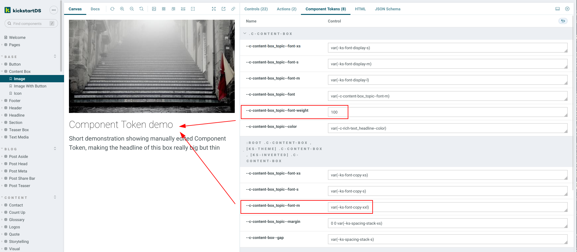
Our storybook-adddon-component-tokens addon displays CSS Custom Properties used inside a component directly as part of your Storybook. It extracts those values using custom-property-extract, and then converts those to a format displayed alongside your component.
This helps in making token associations explicit (which Component Token uses what Design Token under the hood), while also illustrating the layering of tokens inside a single component (for example to generate style variations).
You can also interact with those variables, for example changing some colors around. Those changes get persisted in your browser session, so you can easily verify if your changes work in the context of other components, too (the new color on that button might not be accessible when used in you Hero component, after all). There's currently no way of persisting changes made in the browser in this way, but we're thinking about this. Let us know if that's something that you'd be interested in!
Show me a working demo (click on the Component Tokens addon tab)
View the addon on Github: https://github.com/kickstartDS/storybook-addon-component-tokens
Or directly on Storybooks page: https://storybook.js.org/addons/@kickstartds/storybook-addon-component-tokens/
What it's for
Main things you can do with this addon:
- Look through defined and layered Component Token
- Modify token assignments live in Storybook
- Test those changed tokens in all available contexts
Getting started
_10yarn add --dev @kickstartds/storybook-addon-component-tokens
Enable the addon in .storybook/main.js:
_10module.exports = {_10 addons: ['@kickstartds/storybook-addon-component-tokens'],_10};
To use it inside MDX, or when customising the docs page:
_10import { CssPropsBlock } from '@kickstartds/storybook-addon-component-tokens';
Usage
Include your component tokens, the addon will apply and document this automatically.
_13export default {_13 title: "Simple Component",_13 parameters: {_13 cssprops: {_13 "--color-primary": [_13 {_13 value: "#ff017d",_13 selector: ":root"_13 }_13 ]_13 }_13 },_13} as Meta;
For a more detailed description of this integration, have a look at part three of our "Create your Design System" guide.
Adding to DocsPage and MDX
This is currently not documented. But feel free to ping us on Twitter or Discord to learn more about this.
DocsPage
Modify the docs page based by following the storybook docs. Including <CssPropsBlock /> where you prefer.
Advanced configuration
This addon is still early, advanced configuration options will be added at a later date. Feel free to let us know in the issues if something specific is unclear, or doesn't work!