Generated Controls
Using Controls, and the Controls addon, is one of the main reasons for choosing Storybook. They really help bring your components to life! To quote from the source:

Just that this (normally) comes with one caveat: You'll have to decide to either:
- Live with the inferred defaults the addon automatically creates for you (but this is uncurated), or
- explicitly define controls for your properties yourself (Storybook accounts for that, but it's extra work), or finally
- just disable Controls to reduce potential confusion
Usage with kickstartDS
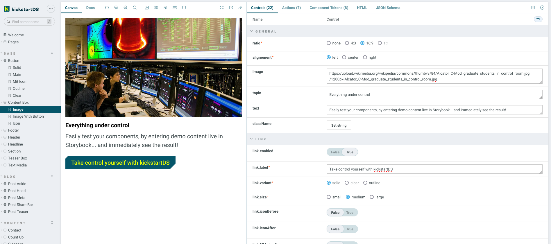
If you think about it, everything that should be available in your Controls is already defined by your respective component API, anyway. This is why we've written some helpers that do this for you... as long as a valid JSON Schema is found for your component, it will automatically be decorated with documentation for all its properties in Storybook, and in your Controls addon.
Features
Using our helpers provides the following conversion for your JSON Schema:
- Add type of Control based on JSON Schema field type
- Add title, description and meta info like
required - Automatically flatten nested structures for Storybook Args compatibility
- Use that information to intelligently group Controls for a better overview
Implementation
You can find the implementation in our Github mono-repository:
https://github.com/kickstartDS/kickstartDS/tree/next/packages/components/core/source/storybook/helpers.ts
There are four functions exported to be used in your own stories for Storybook Controls:
| Function | Description |
|---|---|
| getArgsShared | Takes a JSON Schema and returns Args and ArgTypes |
| pack | Takes a component instance (JSON object) and returns it with flattened keys |
| unpack | Takes a flattened instance and returns the complete JSON object |
| unpackDecorator | Decorator you can use to add unpacking to all stories |
Integration
Integration works by adding the unpackDecorator to all of your stories in .storybook/preview.js:
This ensures props passed down to our components by Storybook Args get converted back to their original, deep JSON structure by default.
And in stories themselves you'll have to use getArgsShared to get Args and ArgTypes to configure your components. See the example below, on how that would look for a Button story.
Example
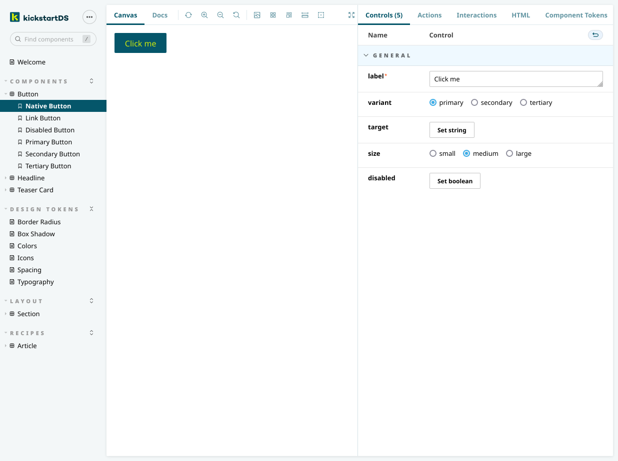
Component
Let's take the Button as an example. This is the JSON Schema we've defined for an adapted version of it, as part of the "Create your Design System" guide:
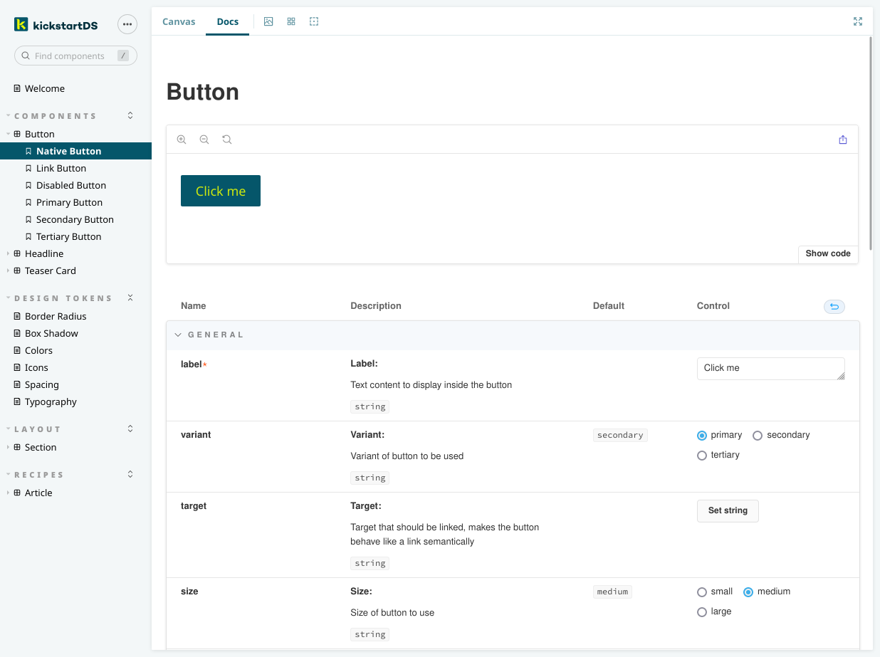
Button, while also generating the full documentation block for the Docs viewStory
The corresponding story for our Button might look a little like this when adding all our helpers:
Import helpers and schema
First we import all helpers we'll use, and the dereferenced version ouf our components JSON Schema.
Get Args and ArgTypes
We pull out args (as defaultArgs) and argTypes for our schema out of getArgsShared.
Pass through args in Template
We tell our Template to pass through our unpacked (by the unpackDecorator) args to the component.
Add Args and ArgTypes to story
Setting args and argTypes in the default export ensures all variants of the story we'll use will share the same, correct definition.
Pack arguments given to story instances
Finally, we'll need to pack options given to our stories / components.
Have a look at the "Adapt Button component" guide for a full version of the Button component shown here.