
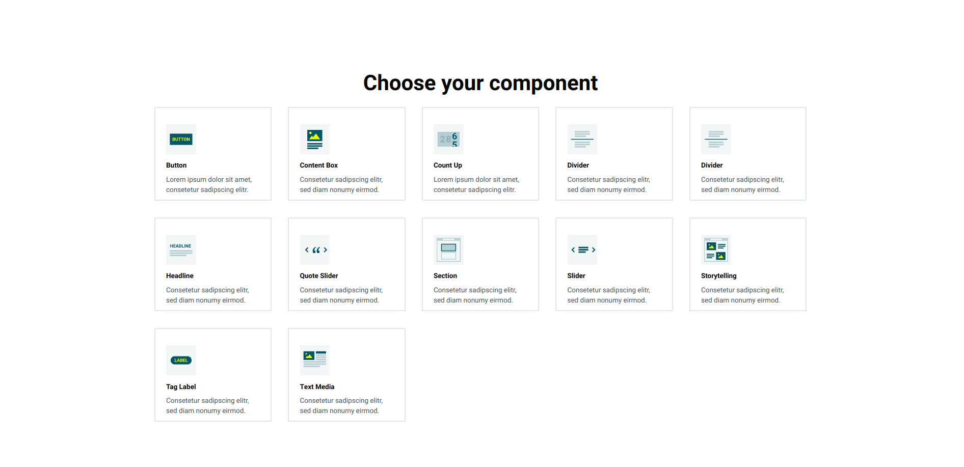
Create TeaserCard component

This guided example show how to find a fitting, existing kickstartDS base component for one of your use cases, to repurpose it. Meaning: you start with some requirements, match an existing component, find a fitting new name for the use case, and give it a new purpose by greatly restricting and rewiring its options for the new context.

Even while using the component rather directly from kickstartDS, you'll want to find the correct set of properties for your own use case. Components in kickstartDS come equipped with properties for a wide range of possible use cases, so it makes sense to reduce those to the ones you really need... to make components easier to understand, use and reason about!

We call this type of workflow Creation. Learn more about it in our dedicated guide about it. If you're unsure about something, have a look over there. We go into more background detail there about what we're doing here.

Not touching the actual markup generated by components let's us get by without adding any custom styling (CSS / SCSS) to it. We simply reuse the already existing Design Token and component structure.

Overview

This is how the result of this guide will look like:

It will only need three simple steps for that:

  1. Component Definition,
  2. Component Mapping, and
  3. Component Creation

For more details about those steps, have a look at the guide about different component processes and their shared structure.

Requirements

This guide assumes that you already have a working Design System, that is based on kickstartDS, running.
If that's not the case, follow our Create your Design System guide.

1. Component Definition

Purpose

We want to be able to flexibly tease content in a unified way. We think it should feel clean and modern, by looking like a card component. Otherwise, we'd just want to add the obvious things to such a card... headline, text, a link and optionally a cover image.

It would also be important to us that the component supports being inverted, as that's a feature we've used in other parts of our Design System extensively (for example our Section). Components working together nicely, and sharing the same overarching concepts is a key tenant of using a Design System!

We give our component the name TeaserCard.

Structure

Defining the structure of a component means finding the component API for it:

PropertyTypeDescription
headline *stringHeadline for the teaser card
text *stringBody text for the teaser card
imagestring(Optional) image to display as cover
invertedbooleanShow inverted version of card?
target *stringTarget that should be linked

Fields that should be required are marked with a *.

While directly helping us get a better grasp on our new component, these will also be used to write our JSON Schema later!

2. Component Mapping

Next we want to search for components that could be of use in assembling this new one. This might be a single, big component that more or less directly fits our use case, or alternatively a combination of components that could serve as the basis by combining them.

This will then serve as our kickstartDS base component, which will be adjusted to fit our needs!

Matching it

From a quick glance, our TeaserBox component seems like it might fit the bill quite nicely! It has options for a headline (topic),text (text), inverted (inverted) and image (image), and we can simplify its link for our target.

It's inverted feature is also based on the general kickstartDS component and Design Token functionality, fulfilling that requirement of ours:

For a complete overview of the available options, take a look at the TeaserBox component API here:
https://www.kickstartds.com/storybook/?path=/docs/base-teaser-box--linked-with-button

Adjustments

This only gives us a rough sketch, though. We still need to adjust the example code to exactly fit our needs. In the process we will hard-code a bunch of options, because we're only interested in a specific set of them. The rest can be set to default values, which don't need to become part of the component API.

Lorem Ipsum

Lorem ipsum dolor sit amet, consectetur adipisicing elit. Lorem ispum dolor distinctio minima unde voluptatum aut. Lorem ipsum dolor sit amet.

Start with an existing TeaserBox component variant

We'll start by copying the JSX code for the Linked With Button variant of our TeaserBox component, from here:
https://www.kickstartds.com/storybook/?path=/docs/base-teaser-box--linked-with-button


_21
<TeaserBox
_21
image="https://picsum.photos/seed/kdsteaserbox/500/300"
_21
link={{
_21
fillAnimation: false,
_21
hidden: false,
_21
href: 'https://example.com',
_21
icon: {
_21
icon: 'chevron-right',
_21
},
_21
iconAfter: true,
_21
iconAnimation: false,
_21
iconBefore: false,
_21
label: 'learn more',
_21
newTab: false,
_21
size: 'medium',
_21
variant: 'solid',
_21
}}
_21
ratio="16:9"
_21
text="Lorem ipsum dolor sit amet, consectetur adipisicing elit. Lorem ispum dolor distinctio minima unde voluptatum aut. Lorem ipsum dolor sit amet."
_21
topic="Lorem Ipsum"
_21
/>

Remove all of the unneeded stuff

There are a bunch of properties that are completely optional in the copied JSX, or ones which just state the default value of that property anyway. Those can be freely removed.
In the case of our TeaserCard, we drop ratio and some of the link options!


_10
<TeaserBox
_10
image="https://picsum.photos/seed/kdsteaserbox/500/300"
_10
link={{
_10
href: 'https://example.com',
_10
label: 'learn more',
_10
}}
_10
text="Lorem ipsum dolor sit amet, consectetur adipisicing elit. Lorem ispum dolor distinctio minima unde voluptatum aut. Lorem ipsum dolor sit amet."
_10
topic="Lorem Ipsum"
_10
/>

Lorem Ipsum

Lorem ipsum dolor sit amet, consectetur adipisicing elit. Lorem ispum dolor distinctio minima unde voluptatum aut. Lorem ipsum dolor sit amet.

Hard-code static, required properties

We add Read more as the static text for the link included with our TeaserCard.


_10
<TeaserBox
_10
image="https://picsum.photos/seed/kdsteaserbox/500/300"
_10
link={{
_10
href: 'https://example.com',
_10
label: 'Read more',
_10
}}
_10
text="Lorem ipsum dolor sit amet, consectetur adipisicing elit. Lorem ispum dolor distinctio minima unde voluptatum aut. Lorem ipsum dolor sit amet."
_10
topic="Lorem Ipsum"
_10
/>

Lorem Ipsum

Lorem ipsum dolor sit amet, consectetur adipisicing elit. Lorem ispum dolor distinctio minima unde voluptatum aut. Lorem ipsum dolor sit amet.

Add some demo content

Now we just need to enter some "real" content, and we've successfully recreated what we set out to do in the start. At least for the markup part!


_10
<TeaserBox
_10
image="https://www.kickstartds.com/static/bdfbb12379bfec9128d8849c55f862a7/Blog-Post_design-system-initiative-1.png"
_10
link={{
_10
href: 'https://mydesignsystem.com/articles',
_10
label: 'Read more',
_10
}}
_10
text="How our initiative workshop series helps customers to decide for or against building a design system."
_10
topic="Design System Initiative"
_10
/>

Design System Initiative

How our initiative workshop series helps customers to decide for or against building a design system.

Start with an existing TeaserBox component variant

We'll start by copying the JSX code for the Linked With Button variant of our TeaserBox component, from here:
https://www.kickstartds.com/storybook/?path=/docs/base-teaser-box--linked-with-button

Remove all of the unneeded stuff

There are a bunch of properties that are completely optional in the copied JSX, or ones which just state the default value of that property anyway. Those can be freely removed.
In the case of our TeaserCard, we drop ratio and some of the link options!

Hard-code static, required properties

We add Read more as the static text for the link included with our TeaserCard.

Add some demo content

Now we just need to enter some "real" content, and we've successfully recreated what we set out to do in the start. At least for the markup part!


_21
<TeaserBox
_21
image="https://picsum.photos/seed/kdsteaserbox/500/300"
_21
link={{
_21
fillAnimation: false,
_21
hidden: false,
_21
href: 'https://example.com',
_21
icon: {
_21
icon: 'chevron-right',
_21
},
_21
iconAfter: true,
_21
iconAnimation: false,
_21
iconBefore: false,
_21
label: 'learn more',
_21
newTab: false,
_21
size: 'medium',
_21
variant: 'solid',
_21
}}
_21
ratio="16:9"
_21
text="Lorem ipsum dolor sit amet, consectetur adipisicing elit. Lorem ispum dolor distinctio minima unde voluptatum aut. Lorem ipsum dolor sit amet."
_21
topic="Lorem Ipsum"
_21
/>

Lorem Ipsum

Lorem ipsum dolor sit amet, consectetur adipisicing elit. Lorem ispum dolor distinctio minima unde voluptatum aut. Lorem ipsum dolor sit amet.

With our small component API in place, and this rough sketch for the markup in mind, we can start actually implementing our component!

3. Component Creation

We like to colocate components. This means to have all involved files next to each other in the same folder; the template (.jsx / .tsx), potential CSS / SASS (.css / .scss), JavaScript (.js / .ts), our JSON Schema component definition (.schema.json), and so on.

So we start by creating the directory src/components/teaser-card, from our Design System repository root:


_10
mkdir -p src/components/teaser-card

This is the folder we'll add new files to in the coming few paragraphs.

JSON Schema definition

First file we'll create is the JSON Schema definition, encoding the structure we've defined for our component before:

Finished JSON Schema

We'll work our way up to this JSON Schema definition.

src/components/teaser-card/teaser-card.schema.json

_40
{
_40
"$schema": "http://json-schema.org/draft-07/schema#",
_40
"$id": "http://schema.mydesignsystem.com/teaser-card.schema.json",
_40
"title": "Teaser Card",
_40
"description": "Component used to tease content",
_40
"type": "object",
_40
"properties": {
_40
"headline": {
_40
"type": "string",
_40
"title": "Headline",
_40
"description": "Headline for the teaser card",
_40
"format": "markdown"
_40
},
_40
"text": {
_40
"type": "string",
_40
"title": "Text",
_40
"description": "Body text for the teaser card",
_40
"format": "markdown"
_40
},
_40
"target": {
_40
"type": "string",
_40
"title": "Target",
_40
"description": "Target that should be linked",
_40
"format": "uri"
_40
},
_40
"image": {
_40
"type": "string",
_40
"title": "Image",
_40
"description": "Image to display as cover",
_40
"format": "uri"
_40
},
_40
"inverted": {
_40
"type": "boolean",
_40
"title": "Invert card?",
_40
"description": "Whether to invert the card",
_40
"default": false
_40
}
_40
},
_40
"required": ["headline", "text", "target"]
_40
}

Start with just the boilerplate for a component definition

This includes all necessarily required values for a valid component definition in kickstartDS.

src/components/teaser-card/teaser-card.schema.json

_10
{
_10
"$schema": "http://json-schema.org/draft-07/schema#",
_10
"$id": "",
_10
"title": "",
_10
"description": "",
_10
"type": "object",
_10
"properties": {}
_10
}

Add basic info describing component

We start by adding a title, description and $id attribute. The correct $id depends on your Design System configuration. We'll assume you've created components before, living under the schema prefix http://schema.mydesignsystem.com.

src/components/teaser-card/teaser-card.schema.json

_10
{
_10
"$schema": "http://json-schema.org/draft-07/schema#",
_10
"$id": "http://schema.mydesignsystem.com/teaser-card.schema.json",
_10
"title": "Teaser Card",
_10
"description": "Component used to tease content",
_10
"type": "object",
_10
"properties": {}
_10
}

Create headline and text fields...

Both fields are straight-forward string type properties, so we just document them a bit!
We do mark headline and text by setting format to markdown, though, to enable some light RTE-like formatting options of rendered text later on.

src/components/teaser-card/teaser-card.schema.json

_21
{
_21
"$schema": "http://json-schema.org/draft-07/schema#",
_21
"$id": "http://schema.mydesignsystem.com/teaser-card.schema.json",
_21
"title": "Teaser Card",
_21
"description": "Component used to tease content",
_21
"type": "object",
_21
"properties": {
_21
"headline": {
_21
"type": "string",
_21
"title": "Headline",
_21
"description": "Headline for the teaser card",
_21
"format": "markdown"
_21
},
_21
"text": {
_21
"type": "string",
_21
"title": "Text",
_21
"description": "Body text for the teaser card",
_21
"format": "markdown"
_21
}
_21
}
_21
}

... and make both required

We declare headline and text as required on the uppermost object!

src/components/teaser-card/teaser-card.schema.json

_22
{
_22
"$schema": "http://json-schema.org/draft-07/schema#",
_22
"$id": "http://schema.mydesignsystem.com/teaser-card.schema.json",
_22
"title": "Teaser Card",
_22
"description": "Component used to tease content",
_22
"type": "object",
_22
"properties": {
_22
"headline": {
_22
"type": "string",
_22
"title": "Headline",
_22
"description": "Headline for the teaser card",
_22
"format": "markdown"
_22
},
_22
"text": {
_22
"type": "string",
_22
"title": "Text",
_22
"description": "Body text for the teaser card",
_22
"format": "markdown"
_22
}
_22
},
_22
"required": ["headline", "text"]
_22
}

Create target and image fields...

Both fields are also straight-forward string type properties!
We do mark target and image by setting format to uri, this time enable URL-like behaviour for those fields.

src/components/teaser-card/teaser-card.schema.json

_34
{
_34
"$schema": "http://json-schema.org/draft-07/schema#",
_34
"$id": "http://schema.mydesignsystem.com/teaser-card.schema.json",
_34
"title": "Teaser Card",
_34
"description": "Component used to tease content",
_34
"type": "object",
_34
"properties": {
_34
"headline": {
_34
"type": "string",
_34
"title": "Headline",
_34
"description": "Headline for the teaser card",
_34
"format": "markdown"
_34
},
_34
"text": {
_34
"type": "string",
_34
"title": "Text",
_34
"description": "Body text for the teaser card",
_34
"format": "markdown"
_34
},
_34
"target": {
_34
"type": "string",
_34
"title": "Target",
_34
"description": "Target that should be linked",
_34
"format": "uri"
_34
},
_34
"image": {
_34
"type": "string",
_34
"title": "Image",
_34
"description": "Image to display as cover",
_34
"format": "uri"
_34
}
_34
},
_34
"required": ["headline", "text"]
_34
}

... and make target required

We add target as required on the uppermost object!

src/components/teaser-card/teaser-card.schema.json

_34
{
_34
"$schema": "http://json-schema.org/draft-07/schema#",
_34
"$id": "http://schema.mydesignsystem.com/teaser-card.schema.json",
_34
"title": "Teaser Card",
_34
"description": "Component used to tease content",
_34
"type": "object",
_34
"properties": {
_34
"headline": {
_34
"type": "string",
_34
"title": "Headline",
_34
"description": "Headline for the teaser card",
_34
"format": "markdown"
_34
},
_34
"text": {
_34
"type": "string",
_34
"title": "Text",
_34
"description": "Body text for the teaser card",
_34
"format": "markdown"
_34
},
_34
"target": {
_34
"type": "string",
_34
"title": "Target",
_34
"description": "Target that should be linked",
_34
"format": "uri"
_34
},
_34
"image": {
_34
"type": "string",
_34
"title": "Image",
_34
"description": "Image to display as cover",
_34
"format": "uri"
_34
}
_34
},
_34
"required": ["headline", "text", "target"]
_34
}

Add inverted property

As the last property we add inverted, as a boolean.

src/components/teaser-card/teaser-card.schema.json

_40
{
_40
"$schema": "http://json-schema.org/draft-07/schema#",
_40
"$id": "http://schema.mydesignsystem.com/teaser-card.schema.json",
_40
"title": "Teaser Card",
_40
"description": "Component used to tease content",
_40
"type": "object",
_40
"properties": {
_40
"headline": {
_40
"type": "string",
_40
"title": "Headline",
_40
"description": "Headline for the teaser card",
_40
"format": "markdown"
_40
},
_40
"text": {
_40
"type": "string",
_40
"title": "Text",
_40
"description": "Body text for the teaser card",
_40
"format": "markdown"
_40
},
_40
"target": {
_40
"type": "string",
_40
"title": "Target",
_40
"description": "Target that should be linked",
_40
"format": "uri"
_40
},
_40
"image": {
_40
"type": "string",
_40
"title": "Image",
_40
"description": "Image to display as cover",
_40
"format": "uri"
_40
},
_40
"inverted": {
_40
"type": "boolean",
_40
"title": "Invert card?",
_40
"description": "Whether to invert the card",
_40
"default": false
_40
}
_40
},
_40
"required": ["headline", "text", "target"]
_40
}

Finished JSON Schema

Let's have a look at our completed JSON Schema definition.

src/components/teaser-card/teaser-card.schema.json

_40
{
_40
"$schema": "http://json-schema.org/draft-07/schema#",
_40
"$id": "http://schema.mydesignsystem.com/teaser-card.schema.json",
_40
"title": "Teaser Card",
_40
"description": "Component used to tease content",
_40
"type": "object",
_40
"properties": {
_40
"headline": {
_40
"type": "string",
_40
"title": "Headline",
_40
"description": "Headline for the teaser card",
_40
"format": "markdown"
_40
},
_40
"text": {
_40
"type": "string",
_40
"title": "Text",
_40
"description": "Body text for the teaser card",
_40
"format": "markdown"
_40
},
_40
"target": {
_40
"type": "string",
_40
"title": "Target",
_40
"description": "Target that should be linked",
_40
"format": "uri"
_40
},
_40
"image": {
_40
"type": "string",
_40
"title": "Image",
_40
"description": "Image to display as cover",
_40
"format": "uri"
_40
},
_40
"inverted": {
_40
"type": "boolean",
_40
"title": "Invert card?",
_40
"description": "Whether to invert the card",
_40
"default": false
_40
}
_40
},
_40
"required": ["headline", "text", "target"]
_40
}

Finished JSON Schema

We'll work our way up to this JSON Schema definition.

Start with just the boilerplate for a component definition

This includes all necessarily required values for a valid component definition in kickstartDS.

Add basic info describing component

We start by adding a title, description and $id attribute. The correct $id depends on your Design System configuration. We'll assume you've created components before, living under the schema prefix http://schema.mydesignsystem.com.

Create headline and text fields...

Both fields are straight-forward string type properties, so we just document them a bit!
We do mark headline and text by setting format to markdown, though, to enable some light RTE-like formatting options of rendered text later on.

... and make both required

We declare headline and text as required on the uppermost object!

Create target and image fields...

Both fields are also straight-forward string type properties!
We do mark target and image by setting format to uri, this time enable URL-like behaviour for those fields.

... and make target required

We add target as required on the uppermost object!

Add inverted property

As the last property we add inverted, as a boolean.

Finished JSON Schema

Let's have a look at our completed JSON Schema definition.

src/components/teaser-card/teaser-card.schema.json

_40
{
_40
"$schema": "http://json-schema.org/draft-07/schema#",
_40
"$id": "http://schema.mydesignsystem.com/teaser-card.schema.json",
_40
"title": "Teaser Card",
_40
"description": "Component used to tease content",
_40
"type": "object",
_40
"properties": {
_40
"headline": {
_40
"type": "string",
_40
"title": "Headline",
_40
"description": "Headline for the teaser card",
_40
"format": "markdown"
_40
},
_40
"text": {
_40
"type": "string",
_40
"title": "Text",
_40
"description": "Body text for the teaser card",
_40
"format": "markdown"
_40
},
_40
"target": {
_40
"type": "string",
_40
"title": "Target",
_40
"description": "Target that should be linked",
_40
"format": "uri"
_40
},
_40
"image": {
_40
"type": "string",
_40
"title": "Image",
_40
"description": "Image to display as cover",
_40
"format": "uri"
_40
},
_40
"inverted": {
_40
"type": "boolean",
_40
"title": "Invert card?",
_40
"description": "Whether to invert the card",
_40
"default": false
_40
}
_40
},
_40
"required": ["headline", "text", "target"]
_40
}

This concludes creating the JSON Schema. When running the schema generation in our Design System again, we should now automatically end up with a corresponding type definition to be used in creation of the template in the next step:

src/components/teaser-card/TeaserCardProps.ts
src/components/teaser-card/teaser-card.schema.json

_41
/* eslint-disable */
_41
/**
_41
* This file was automatically generated by json-schema-to-typescript.
_41
* DO NOT MODIFY IT BY HAND. Instead, modify the source JSONSchema file,
_41
* and run `yarn run schema` to regenerate this file.
_41
*/
_41
_41
/\*\*
_41
_41
- Headline for the teaser card
_41
\*/
_41
export type Headline = string;
_41
/\*\*
_41
- Body text for the teaser card
_41
\*/
_41
export type Text = string;
_41
/\*\*
_41
- Target that should be linked
_41
\*/
_41
export type Target = string;
_41
/\*\*
_41
- Image to display as cover
_41
\*/
_41
export type Image = string;
_41
/\*\*
_41
- Whether to invert the card
_41
\*/
_41
export type InvertCard = boolean;
_41
_41
/\*\*
_41
_41
- Component used to tease content
_41
\*/
_41
export interface TeaserCardProps {
_41
headline: Headline;
_41
text: Text;
_41
target: Target;
_41
image?: Image;
_41
inverted?: InvertCard;
_41
[k: string]: unknown;
_41
}

How your schema generation is started might change depending on your setup. If you've followed our "Create your Design System" guide before, or want to add it like we do, follow this section of it closely.

React template

As the final step for this example, we'll add the template. This will be a purely functional React component, mapping our component structure (as defined in the JSON Schema) to the original component we're basing our work off of; the kickstartDS Storytelling component.

Finished React template

We'll work our way up to this React template.

src/components/teaser-card/TeaserCardComponent.tsx

_35
import { HTMLAttributes, FC, PropsWithChildren } from "react";
_35
import {
_35
TeaserBoxContextDefault,
_35
TeaserBoxContext,
_35
} from "@kickstartds/base/lib/teaser-box";
_35
import { TeaserCardProps } from "./TeaserCardProps";
_35
_35
export const TeaserCard: FC<
_35
TeaserCardProps & HTMLAttributes<HTMLElement>
_35
> = ({
_35
headline,
_35
text,
_35
target,
_35
image,
_35
inverted,
_35
...props
_35
}) => {
_35
return (
_35
<TeaserBoxContextDefault
_35
{...props}
_35
topic={headline}
_35
text={text}
_35
link={{
_35
label: "Read more",
_35
href: target,
_35
}}
_35
image={image}
_35
inverted={inverted}
_35
/>
_35
);
_35
};
_35
_35
export const TeaserBoxProvider: FC<PropsWithChildren<any>> = (props) => (
_35
<TeaserBoxContext.Provider {...props} value={TeaserCard} />
_35
);

Start with a boilerplate

Again we'll start with a very basic skeleton for our React component. We're using TypeScript here (.tsx), but it works the same with plain JSX (.jsx).

src/components/teaser-card/TeaserCardComponent.tsx

_10
import { HTMLAttributes, FC } from "react";
_10
_10
export const TeaserCard: FC<HTMLAttributes<HTMLDivElement>> = (
_10
props
_10
) => <div {...props}>Lorem ipsum</div>;

Add correct typings

Import and add generated props from TeaserCardProps.ts. Generated by our JSON Schema, these guarantee you're matching your expected component structure while implementing. In combination with TypeScript this enables auto-complete and auto-fix for even better DX! (see here, at the very end of that section, for more details)

We also add HTMLAttributes<HTMLElement> to the type signature for the props that we'll pass through to the native HTML element underneath.

src/components/teaser-card/TeaserCardComponent.tsx

_10
import { HTMLAttributes, FC } from "react";
_10
_10
import { TeaserCardProps } from "./TeaserCardProps";
_10
_10
export const TeaserCard: FC<
_10
TeaserCardProps & HTMLAttributes<HTMLElement>
_10
> = ({ ...props }) => <div {...props}>Lorem ipsum</div>;

Destructure props

We also need to add our own properties, so we'll destructure props. We'll just pass through everything HTMLAttributes related!

src/components/teaser-card/TeaserCardComponent.tsx

_16
import { HTMLAttributes, FC } from "react";
_16
_16
import { TeaserCardProps } from "./TeaserCardProps";
_16
_16
export const TeaserCard: FC<
_16
TeaserCardProps & HTMLAttributes<HTMLElement>
_16
> = ({
_16
headline,
_16
text,
_16
target,
_16
image,
_16
inverted,
_16
...props
_16
}) => (
_16
<div {...props}>Lorem ipsum</div>
_16
));

Add TeaserCard component 1/5

Now we'll import and add the kickstartDS TeaserBox component. To start, we'll use the hard-coded properties of the Linked With Button TeaserBox variant from our kickstartDS Design System.

src/components/teaser-card/TeaserCardComponent.tsx

_42
import { HTMLAttributes, FC } from "react";
_42
_42
import {
_42
TeaserBoxContextDefault,
_42
} from "@kickstartds/base/lib/teaser-box";
_42
_42
import { TeaserCardProps } from "./TeaserCardProps";
_42
_42
export const TeaserCard: FC<
_42
TeaserCardProps & HTMLAttributes<HTMLElement>
_42
> = ({
_42
headline,
_42
text,
_42
target,
_42
image,
_42
inverted,
_42
...props
_42
}) => {
_42
return (
_42
<TeaserBoxContextDefault
_42
image="https://picsum.photos/seed/kdsteaserbox/500/300"
_42
link={{
_42
fillAnimation: false,
_42
hidden: false,
_42
href: 'https://example.com',
_42
icon: {
_42
icon: 'chevron-right'
_42
},
_42
iconAfter: true,
_42
iconAnimation: false,
_42
iconBefore: false,
_42
label: 'learn more',
_42
newTab: false,
_42
size: 'medium',
_42
variant: 'solid'
_42
}}
_42
ratio="16:9"
_42
text="Lorem ipsum dolor sit amet, consectetur adipisicing elit. Lorem ispum dolor distinctio minima unde voluptatum aut. Lorem ipsum dolor sit amet."
_42
topic="Lorem Ipsum"
_42
/>
_42
)
_42
};

Add TeaserCard component 2/5

We remove all of the unneeded stuff, as there are a bunch of properties that are completely optional, mainly those having their values undefined or null in the copied JSX, or ones which just state the default value of that property anyway. Those can be freely removed.

src/components/teaser-card/TeaserCardComponent.tsx

_30
import { HTMLAttributes, FC } from "react";
_30
_30
import {
_30
TeaserBoxContextDefault,
_30
} from "@kickstartds/base/lib/teaser-box";
_30
_30
import { TeaserCardProps } from "./TeaserCardProps";
_30
_30
export const TeaserCard: FC<
_30
TeaserCardProps & HTMLAttributes<HTMLElement>
_30
> = ({
_30
headline,
_30
text,
_30
target,
_30
image,
_30
inverted,
_30
...props
_30
}) => {
_30
return (
_30
<TeaserBoxContextDefault
_30
topic="Lorem Ipsum"
_30
text="Lorem ipsum dolor sit amet, consectetur adipisicing elit. Lorem ispum dolor distinctio minima unde voluptatum aut. Lorem ipsum dolor sit amet."
_30
link={{
_30
href: 'https://example.com',
_30
label: 'learn more',
_30
}}
_30
image="https://picsum.photos/seed/kdsteaserbox/500/300"
_30
/>
_30
)
_30
};

Add TeaserCard component 3/5

We then connect the props as defined in our component API that are directly taken from the underlying kickstartDS base component by just passing them through. We also destructure props first, so our own properties take precedence when set.

src/components/teaser-card/TeaserCardComponent.tsx

_32
import { HTMLAttributes, FC } from "react";
_32
_32
import {
_32
TeaserBoxContextDefault,
_32
} from "@kickstartds/base/lib/teaser-box";
_32
_32
import { TeaserCardProps } from "./TeaserCardProps";
_32
_32
export const TeaserCard: FC<
_32
TeaserCardProps & HTMLAttributes<HTMLElement>
_32
> = ({
_32
headline,
_32
text,
_32
target,
_32
image,
_32
inverted,
_32
...props
_32
}) => {
_32
return (
_32
<TeaserBoxContextDefault
_32
{...props}
_32
topic="Lorem Ipsum"
_32
text={text}
_32
link={{
_32
href: 'https://example.com',
_32
label: 'learn more',
_32
}}
_32
image={image}
_32
inverted={inverted}
_32
/>
_32
)
_32
};

Add TeaserCard component 4/5

We renamed topic to headline in our component API, so we add that in its renamed form.

src/components/teaser-card/TeaserCardComponent.tsx

_32
import { HTMLAttributes, FC } from "react";
_32
_32
import {
_32
TeaserBoxContextDefault,
_32
} from "@kickstartds/base/lib/teaser-box";
_32
_32
import { TeaserCardProps } from "./TeaserCardProps";
_32
_32
export const TeaserCard: FC<
_32
TeaserCardProps & HTMLAttributes<HTMLElement>
_32
> = ({
_32
headline,
_32
text,
_32
target,
_32
image,
_32
inverted,
_32
...props
_32
}) => {
_32
return (
_32
<TeaserBoxContextDefault
_32
{...props}
_32
topic={headline}
_32
text={text}
_32
link={{
_32
href: 'https://example.com',
_32
label: 'learn more',
_32
}}
_32
image={image}
_32
inverted={inverted}
_32
/>
_32
)
_32
};

Add TeaserCard component 5/5

Finally we add our hard coded Read More to the link.label, and connect target to link.href.

src/components/teaser-card/TeaserCardComponent.tsx

_32
import { HTMLAttributes, FC } from "react";
_32
_32
import {
_32
TeaserBoxContextDefault,
_32
} from "@kickstartds/base/lib/teaser-box";
_32
_32
import { TeaserCardProps } from "./TeaserCardProps";
_32
_32
export const TeaserCard: FC<
_32
TeaserCardProps & HTMLAttributes<HTMLElement>
_32
> = ({
_32
headline,
_32
text,
_32
target,
_32
image,
_32
inverted,
_32
...props
_32
}) => {
_32
return (
_32
<TeaserBoxContextDefault
_32
{...props}
_32
topic={headline}
_32
text={text}
_32
link={{
_32
label: "Read more",
_32
href: target,
_32
}}
_32
image={image}
_32
inverted={inverted}
_32
/>
_32
)
_32
};

Add component Provider

We want our TeaserCard to replace all default kickstartDS base TeaserBoxes, no matter where they appear. We add a Provider for that purpose now!

src/components/teaser-card/TeaserCardComponent.tsx

_37
import { HTMLAttributes, FC, PropsWithChildren } from "react";
_37
_37
import {
_37
TeaserBoxContextDefault,
_37
TeaserBoxContext,
_37
} from "@kickstartds/base/lib/teaser-box";
_37
_37
import { TeaserCardProps } from "./TeaserCardProps";
_37
_37
export const TeaserCard: FC<
_37
TeaserCardProps & HTMLAttributes<HTMLElement>
_37
> = ({
_37
headline,
_37
text,
_37
target,
_37
image,
_37
inverted,
_37
...props
_37
}) => {
_37
return (
_37
<TeaserBoxContextDefault
_37
{...props}
_37
topic={headline}
_37
text={text}
_37
link={{
_37
label: "Read more",
_37
href: target,
_37
}}
_37
image={image}
_37
inverted={inverted}
_37
/>
_37
)
_37
};
_37
_37
export const TeaserBoxProvider: FC<PropsWithChildren<any>> = (props) => (
_37
<TeaserBoxContext.Provider {...props} value={TeaserCard} />
_37
);

Finished React template

Let's have a look at our completed React template.

src/components/teaser-card/TeaserCardComponent.tsx

_37
import { HTMLAttributes, FC, PropsWithChildren } from "react";
_37
_37
import {
_37
TeaserBoxContextDefault,
_37
TeaserBoxContext,
_37
} from "@kickstartds/base/lib/teaser-box";
_37
_37
import { TeaserCardProps } from "./TeaserCardProps";
_37
_37
export const TeaserCard: FC<
_37
TeaserCardProps & HTMLAttributes<HTMLElement>
_37
> = ({
_37
headline,
_37
text,
_37
target,
_37
image,
_37
inverted,
_37
...props
_37
}) => {
_37
return (
_37
<TeaserBoxContextDefault
_37
{...props}
_37
topic={headline}
_37
text={text}
_37
link={{
_37
label: "Read more",
_37
href: target,
_37
}}
_37
image={image}
_37
inverted={inverted}
_37
/>
_37
)
_37
};
_37
_37
export const TeaserBoxProvider: FC<PropsWithChildren<any>> = (props) => (
_37
<TeaserBoxContext.Provider {...props} value={TeaserCard} />
_37
);

Finished React template

We'll work our way up to this React template.

Start with a boilerplate

Again we'll start with a very basic skeleton for our React component. We're using TypeScript here (.tsx), but it works the same with plain JSX (.jsx).

Add correct typings

Import and add generated props from TeaserCardProps.ts. Generated by our JSON Schema, these guarantee you're matching your expected component structure while implementing. In combination with TypeScript this enables auto-complete and auto-fix for even better DX! (see here, at the very end of that section, for more details)

We also add HTMLAttributes<HTMLElement> to the type signature for the props that we'll pass through to the native HTML element underneath.

Destructure props

We also need to add our own properties, so we'll destructure props. We'll just pass through everything HTMLAttributes related!

Add TeaserCard component 1/5

Now we'll import and add the kickstartDS TeaserBox component. To start, we'll use the hard-coded properties of the Linked With Button TeaserBox variant from our kickstartDS Design System.

Add TeaserCard component 2/5

We remove all of the unneeded stuff, as there are a bunch of properties that are completely optional, mainly those having their values undefined or null in the copied JSX, or ones which just state the default value of that property anyway. Those can be freely removed.

Add TeaserCard component 3/5

We then connect the props as defined in our component API that are directly taken from the underlying kickstartDS base component by just passing them through. We also destructure props first, so our own properties take precedence when set.

Add TeaserCard component 4/5

We renamed topic to headline in our component API, so we add that in its renamed form.

Add TeaserCard component 5/5

Finally we add our hard coded Read More to the link.label, and connect target to link.href.

Add component Provider

We want our TeaserCard to replace all default kickstartDS base TeaserBoxes, no matter where they appear. We add a Provider for that purpose now!

Finished React template

Let's have a look at our completed React template.

src/components/teaser-card/TeaserCardComponent.tsx

_35
import { HTMLAttributes, FC, PropsWithChildren } from "react";
_35
import {
_35
TeaserBoxContextDefault,
_35
TeaserBoxContext,
_35
} from "@kickstartds/base/lib/teaser-box";
_35
import { TeaserCardProps } from "./TeaserCardProps";
_35
_35
export const TeaserCard: FC<
_35
TeaserCardProps & HTMLAttributes<HTMLElement>
_35
> = ({
_35
headline,
_35
text,
_35
target,
_35
image,
_35
inverted,
_35
...props
_35
}) => {
_35
return (
_35
<TeaserBoxContextDefault
_35
{...props}
_35
topic={headline}
_35
text={text}
_35
link={{
_35
label: "Read more",
_35
href: target,
_35
}}
_35
image={image}
_35
inverted={inverted}
_35
/>
_35
);
_35
};
_35
_35
export const TeaserBoxProvider: FC<PropsWithChildren<any>> = (props) => (
_35
<TeaserBoxContext.Provider {...props} value={TeaserCard} />
_35
);

To complete the template we add the TeaserBoxProvider to our src/components/Providers.jsx:

src/components/Providers.jsx

_14
import { ButtonProvider } from "./button/ButtonComponent";
_14
import { SectionProvider } from "./section/SectionComponent";
_14
import { TeaserBoxProvider } from "./teaser-card/TeaserCardComponent";
_14
import { HeadlineProvider } from "./headline/HeadlineComponent";
_14
_14
export default (props) => (
_14
<ButtonProvider>
_14
<HeadlineProvider>
_14
<SectionProvider>
_14
<TeaserBoxProvider {...props} />
_14
</SectionProvider>
_14
</HeadlineProvider>
_14
</ButtonProvider>
_14
);

This concludes the creation of our new TeaserCard component. It's now ready to be used inside your Design System, and available to your down stream consumers... hopefully efficiently closing a gap for them!

Use of Storybook

If you're using Storybook, you can follow this part of the example to get all the integration goodness possible with kickstartDS!

Storybook setup

This guide assumes you're using a set up like described in our Create your Design System guide! Be sure to adapt commands and configuration to your use accordingly, when following this part!

Add the following file to your src/components/teaser-card folder:

Import TeaserCard component

Import TeaserCard component and add it to the Template that we'll bind Stories to.

Import Storybook Controls helpers

Import dereferenced component JSON Schema and getArgsShared helper to generate Storybook Controls, and parameterize Storybook JSON Schema Addon.

Import re-usable TeaserCard Stories...

We import the existing TeaserCard Story part of @kickstartDS/base, to re-use all the default settings.

... and overwrite values where needed

We set all the Story defaults specific to our component.

Convert args to flat keys

We use pack to convert all deep JSON args to flat (. delimited) keys and values. This is the format your Storybook Controls get generated off.

Create TeaserCard variants

We do this by binding to our Template, and use pack to convert all deep JSON args to flat (. delimited) keys and values. This is the format your Storybook Controls get generated off.

src/components/teaser-card/TeaserCard.stories.jsx

_27
import { TeaserCard } from "./TeaserCardComponent";
_27
import { pack, getArgsShared } from "@kickstartds/core/lib/storybook";
_27
import TeaserBoxStories from "@kickstartds/base/lib/teaser-box/teaser-box.stories";
_27
import schema from "./teaser-card.schema.dereffed.json";
_27
_27
const { args, argTypes } = getArgsShared(schema);
_27
_27
const Template = (args) => <TeaserCard {...args} />;
_27
_27
export default {
_27
...TeaserBoxStories,
_27
title: "Components/Teaser Card",
_27
args,
_27
argTypes,
_27
parameters: {
_27
jsonschema: schema,
_27
},
_27
};
_27
_27
export const CardWithImage = Template.bind({});
_27
CardWithImage.args = pack({
_27
headline: "TeaserCard headline",
_27
text: "TeaserCard text content that can be quite a bit longer, and use **Markdown**",
_27
target: "#",
_27
image: "https://images.unsplash.com/photo-1665125143199-a6b44a9e1b21?crop=entropy&cs=tinysrgb&fit=max&fm=jpg&ixid=MnwxfDB8MXxyYW5kb218MHx8fHx8fHx8MTY2NzUxNDQyOA&ixlib=rb-1.2.1&q=80&w=1080",
_27
inverted: false
_27
});

If you reopen your Storybook now, or if you kept it running while following along, you should now see your new TeaserCard in all its glory!

Finished Code Sandbox

You can also have a look at the completed component in the following Code Sandbox:

Toggle the file browser with the hamburger icon at the top left, or open it directly in your browser.


_10