
Customize Headline component

This guided example shows how you'd add components to your Design System that use a kickstartDS base component pretty directly. But unlike just adapting a component, customizing a component also involves adding something to it, or changing the way certain things work under the hood, by modifying its React template (whereas extending a component does that by composing multiple kickstartDS base components). This expands possible applications of existing kickstartDS components greatly.

Even while using the component rather directly from kickstartDS, you'll want to find the correct set of properties for your own use case. Components in kickstartDS come equipped with properties for a wide range of possible use cases, so it makes sense to reduce those to the ones you really need... to make components easier to understand, use and reason about!

We call this type of workflow Customization. Learn more about it in our dedicated guide about it. If you're unsure about something, have a look over there. We go into more background detail there about what we're doing here.

Not touching the actual markup generated by components let's us get by without adding any custom styling (CSS / SCSS) to it. We simply reuse the already existing Design Token and component structure.

Overview

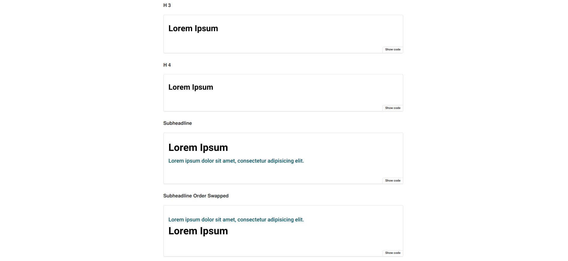
This is how the result of this guide will look like:

It will only need two simple steps for that:

  1. Component Definition, and
  2. Component Creation

For more details about those steps, have a look at the guide about different component processes and their shared structure.

Requirements

This guide assumes that you already have a working Design System, that is based on kickstartDS, running.
If that's not the case, follow our Create your Design System guide.

1. Component Definition

Purpose

We like what the kickstartDS base Headline component has to offer. We just feel that we need a bit more flexibility in arranging the headlines different contents, which we try to achieve by making the order of headline and subheadline switcheable. We also want some light RTE-like content formatting options for all rendered text, while keeping the component simple by just mapping properties really needed by our use case.

We take level and spaceAfter directly, and rename subheadline to sub, styleAs to style and content to text for our version of the Headline. And crucially we add our own property switchOrder into the mix.

We also keep the name Headline, as it fits our use case well enough already.

Structure

Defining the structure of a component means finding the component API for it:

PropertyTypeDescription
text *stringText content of headline
substringSubheadline content
switchOrderbooleanSwitch order of headline and subheadline
level *enumLevel of headline to use
styleenumStyle of headline to show
spaceAfterenumWhether to display space after headline

Fields that should be required are marked with a *.

While directly helping us get a better grasp on our new component, these will also be used to write our JSON Schema later!

2. Component Creation

We like to colocate components. This means to have all involved files next to each other in the same folder; the template (.jsx / .tsx), potential CSS / SASS (.css / .scss), JavaScript (.js / .ts), our JSON Schema component definition (.schema.json), and so on.

So we start by creating the directory src/components/headline, from our Design System repository root:


_10
mkdir -p src/components/headline

This is the folder we'll add new files to in the coming few paragraphs.

JSON Schema definition

First file we'll create is the JSON Schema definition, encoding the structure we've defined for our component before:

Finished JSON Schema

We'll work our way up to this JSON Schema definition.

src/components/headline/headline.schema.json

_49
{
_49
"$schema": "http://json-schema.org/draft-07/schema#",
_49
"$id": "http://schema.mydesignsystem.com/headline.schema.json",
_49
"title": "Headline",
_49
"description": "Component used for headlines",
_49
"type": "object",
_49
"properties": {
_49
"text": {
_49
"type": "string",
_49
"title": "Text",
_49
"description": "Text content of headline",
_49
"format": "markdown"
_49
},
_49
"sub": {
_49
"type": "string",
_49
"title": "Sub",
_49
"description": "Subheadline content",
_49
"format": "markdown"
_49
},
_49
"switchOrder": {
_49
"type": "boolean",
_49
"title": "Switch order?",
_49
"description": "Switch order of headline and subheadline",
_49
"default": false
_49
},
_49
"level": {
_49
"type": "string",
_49
"title": "Level",
_49
"description": "Level of headline to use",
_49
"enum": ["h1", "h2", "h3", "h4", "p"],
_49
"default": "h2"
_49
},
_49
"style": {
_49
"type": "string",
_49
"title": "Style",
_49
"description": "Style of headline to show",
_49
"enum": ["h1", "h2", "h3", "h4", "p"],
_49
"default": "h2"
_49
},
_49
"spaceAfter": {
_49
"type": "string",
_49
"title": "Space after?",
_49
"description": "Whether to display space after headline",
_49
"enum": ["minimum", "small", "large"],
_49
"default": "small"
_49
}
_49
},
_49
"required": ["level", "text"]
_49
}

Start with just the boilerplate for a component definition

This includes all necessarily required values for a valid component definition in kickstartDS.

src/components/headline/headline.schema.json

_10
{
_10
"$schema": "http://json-schema.org/draft-07/schema#",
_10
"$id": "",
_10
"title": "",
_10
"description": "",
_10
"type": "object",
_10
"properties": {}
_10
}

Add basic info describing component

We start by adding a title, description and $id attribute. The correct $id depends on your Design System configuration. We'll assume you've created components before, living under the schema prefix http://schema.mydesignsystem.com.

src/components/headline/headline.schema.json

_10
{
_10
"$schema": "http://json-schema.org/draft-07/schema#",
_10
"$id": "http://schema.mydesignsystem.com/headline.schema.json",
_10
"title": "Headline",
_10
"description": "Component used for headlines",
_10
"type": "object",
_10
"properties": {}
_10
}

Create text and sub fields...

Both fields are straight-forward string type properties, so we just document them a bit!
We do mark text and sub by setting format to markdown, though, to enable some light RTE-like formatting options of rendered text later on.

src/components/headline/headline.schema.json

_21
{
_21
"$schema": "http://json-schema.org/draft-07/schema#",
_21
"$id": "http://schema.mydesignsystem.com/headline.schema.json",
_21
"title": "Headline",
_21
"description": "Component used for headlines",
_21
"type": "object",
_21
"properties": {
_21
"text": {
_21
"type": "string",
_21
"title": "Text",
_21
"description": "Text content of headline",
_21
"format": "markdown"
_21
},
_21
"sub": {
_21
"type": "string",
_21
"title": "Sub",
_21
"description": "Subheadline content",
_21
"format": "markdown"
_21
}
_21
}
_21
}

... and make text required

We declare text as required on the uppermost object!

src/components/headline/headline.schema.json

_22
{
_22
"$schema": "http://json-schema.org/draft-07/schema#",
_22
"$id": "http://schema.mydesignsystem.com/headline.schema.json",
_22
"title": "Headline",
_22
"description": "Component used for headlines",
_22
"type": "object",
_22
"properties": {
_22
"text": {
_22
"type": "string",
_22
"title": "Text",
_22
"description": "Text content of headline",
_22
"format": "markdown"
_22
},
_22
"sub": {
_22
"type": "string",
_22
"title": "Sub",
_22
"description": "Subheadline content",
_22
"format": "markdown"
_22
}
_22
},
_22
"required": ["text"]
_22
}

Add switchOrder property

Next, we add our new property switchOrder, of type boolean.

src/components/headline/headline.schema.json

_28
{
_28
"$schema": "http://json-schema.org/draft-07/schema#",
_28
"$id": "http://schema.mydesignsystem.com/headline.schema.json",
_28
"title": "Headline",
_28
"description": "Component used for headlines",
_28
"type": "object",
_28
"properties": {
_28
"text": {
_28
"type": "string",
_28
"title": "Text",
_28
"description": "Text content of headline",
_28
"format": "markdown"
_28
},
_28
"sub": {
_28
"type": "string",
_28
"title": "Sub",
_28
"description": "Subheadline content",
_28
"format": "markdown"
_28
},
_28
"switchOrder": {
_28
"type": "boolean",
_28
"title": "Switch order?",
_28
"description": "Switch order of headline and subheadline",
_28
"default": false
_28
},
_28
},
_28
"required": ["text"]
_28
}

Add allowed levels 1/2

We add a level property of type string...

src/components/headline/headline.schema.json

_33
{
_33
"$schema": "http://json-schema.org/draft-07/schema#",
_33
"$id": "http://schema.mydesignsystem.com/headline.schema.json",
_33
"title": "Headline",
_33
"description": "Component used for headlines",
_33
"type": "object",
_33
"properties": {
_33
"text": {
_33
"type": "string",
_33
"title": "Text",
_33
"description": "Text content of headline",
_33
"format": "markdown"
_33
},
_33
"sub": {
_33
"type": "string",
_33
"title": "Sub",
_33
"description": "Subheadline content",
_33
"format": "markdown"
_33
},
_33
"switchOrder": {
_33
"type": "boolean",
_33
"title": "Switch order?",
_33
"description": "Switch order of headline and subheadline",
_33
"default": false
_33
},
_33
"level": {
_33
"type": "string",
_33
"title": "Level",
_33
"description": "Level of headline to use"
_33
}
_33
},
_33
"required": ["text"]
_33
}

Add allowed levels 2/2

... and make it an enum, defining its available options explicitly. We also set a default.

src/components/headline/headline.schema.json

_35
{
_35
"$schema": "http://json-schema.org/draft-07/schema#",
_35
"$id": "http://schema.mydesignsystem.com/headline.schema.json",
_35
"title": "Headline",
_35
"description": "Component used for headlines",
_35
"type": "object",
_35
"properties": {
_35
"text": {
_35
"type": "string",
_35
"title": "Text",
_35
"description": "Text content of headline",
_35
"format": "markdown"
_35
},
_35
"sub": {
_35
"type": "string",
_35
"title": "Sub",
_35
"description": "Subheadline content",
_35
"format": "markdown"
_35
},
_35
"switchOrder": {
_35
"type": "boolean",
_35
"title": "Switch order?",
_35
"description": "Switch order of headline and subheadline",
_35
"default": false
_35
},
_35
"level": {
_35
"type": "string",
_35
"title": "Level",
_35
"description": "Level of headline to use",
_35
"enum": ["h1", "h2", "h3", "h4", "p"],
_35
"default": "h2"
_35
}
_35
},
_35
"required": ["text"]
_35
}

Make level required

We also make level a required field on the uppermost object.

src/components/headline/headline.schema.json

_35
{
_35
"$schema": "http://json-schema.org/draft-07/schema#",
_35
"$id": "http://schema.mydesignsystem.com/headline.schema.json",
_35
"title": "Headline",
_35
"description": "Component used for headlines",
_35
"type": "object",
_35
"properties": {
_35
"text": {
_35
"type": "string",
_35
"title": "Text",
_35
"description": "Text content of headline",
_35
"format": "markdown"
_35
},
_35
"sub": {
_35
"type": "string",
_35
"title": "Sub",
_35
"description": "Subheadline content",
_35
"format": "markdown"
_35
},
_35
"switchOrder": {
_35
"type": "boolean",
_35
"title": "Switch order?",
_35
"description": "Switch order of headline and subheadline",
_35
"default": false
_35
},
_35
"level": {
_35
"type": "string",
_35
"title": "Level",
_35
"description": "Level of headline to use",
_35
"enum": ["h1", "h2", "h3", "h4", "p"],
_35
"default": "h2"
_35
}
_35
},
_35
"required": ["level", "text"]
_35
}

Add allowed styles 1/2

We add a style property of type string...

src/components/headline/headline.schema.json

_40
{
_40
"$schema": "http://json-schema.org/draft-07/schema#",
_40
"$id": "http://schema.mydesignsystem.com/headline.schema.json",
_40
"title": "Headline",
_40
"description": "Component used for headlines",
_40
"type": "object",
_40
"properties": {
_40
"text": {
_40
"type": "string",
_40
"title": "Text",
_40
"description": "Text content of headline",
_40
"format": "markdown"
_40
},
_40
"sub": {
_40
"type": "string",
_40
"title": "Sub",
_40
"description": "Subheadline content",
_40
"format": "markdown"
_40
},
_40
"switchOrder": {
_40
"type": "boolean",
_40
"title": "Switch order?",
_40
"description": "Switch order of headline and subheadline",
_40
"default": false
_40
},
_40
"level": {
_40
"type": "string",
_40
"title": "Level",
_40
"description": "Level of headline to use",
_40
"enum": ["h1", "h2", "h3", "h4", "p"],
_40
"default": "h2"
_40
},
_40
"style": {
_40
"type": "string",
_40
"title": "Style",
_40
"description": "Style of headline to show"
_40
}
_40
},
_40
"required": ["level", "text"]
_40
}

Add allowed styles 2/2

... and make it an enum, defining its available options explicitly. We also set a default.

src/components/headline/headline.schema.json

_42
{
_42
"$schema": "http://json-schema.org/draft-07/schema#",
_42
"$id": "http://schema.mydesignsystem.com/headline.schema.json",
_42
"title": "Headline",
_42
"description": "Component used for headlines",
_42
"type": "object",
_42
"properties": {
_42
"text": {
_42
"type": "string",
_42
"title": "Text",
_42
"description": "Text content of headline",
_42
"format": "markdown"
_42
},
_42
"sub": {
_42
"type": "string",
_42
"title": "Sub",
_42
"description": "Subheadline content",
_42
"format": "markdown"
_42
},
_42
"switchOrder": {
_42
"type": "boolean",
_42
"title": "Switch order?",
_42
"description": "Switch order of headline and subheadline",
_42
"default": false
_42
},
_42
"level": {
_42
"type": "string",
_42
"title": "Level",
_42
"description": "Level of headline to use",
_42
"enum": ["h1", "h2", "h3", "h4", "p"],
_42
"default": "h2"
_42
},
_42
"style": {
_42
"type": "string",
_42
"title": "Style",
_42
"description": "Style of headline to show",
_42
"enum": ["h1", "h2", "h3", "h4", "p"],
_42
"default": "h2"
_42
}
_42
},
_42
"required": ["level", "text"]
_42
}

Add allowed spaceAfters 1/2

We add a spaceAfter property of type string...

src/components/headline/headline.schema.json

_47
{
_47
"$schema": "http://json-schema.org/draft-07/schema#",
_47
"$id": "http://schema.mydesignsystem.com/headline.schema.json",
_47
"title": "Headline",
_47
"description": "Component used for headlines",
_47
"type": "object",
_47
"properties": {
_47
"text": {
_47
"type": "string",
_47
"title": "Text",
_47
"description": "Text content of headline",
_47
"format": "markdown"
_47
},
_47
"sub": {
_47
"type": "string",
_47
"title": "Sub",
_47
"description": "Subheadline content",
_47
"format": "markdown"
_47
},
_47
"switchOrder": {
_47
"type": "boolean",
_47
"title": "Switch order?",
_47
"description": "Switch order of headline and subheadline",
_47
"default": false
_47
},
_47
"level": {
_47
"type": "string",
_47
"title": "Level",
_47
"description": "Level of headline to use",
_47
"enum": ["h1", "h2", "h3", "h4", "p"],
_47
"default": "h2"
_47
},
_47
"style": {
_47
"type": "string",
_47
"title": "Style",
_47
"description": "Style of headline to show",
_47
"enum": ["h1", "h2", "h3", "h4", "p"],
_47
"default": "h2"
_47
},
_47
"spaceAfter": {
_47
"type": "string",
_47
"title": "Space after?",
_47
"description": "Whether to display space after headline"
_47
}
_47
},
_47
"required": ["level", "text"]
_47
}

Add allowed spaceAfters 2/2

... and make it an enum, defining its available options explicitly. We also set a default.

src/components/headline/headline.schema.json

_49
{
_49
"$schema": "http://json-schema.org/draft-07/schema#",
_49
"$id": "http://schema.mydesignsystem.com/headline.schema.json",
_49
"title": "Headline",
_49
"description": "Component used for headlines",
_49
"type": "object",
_49
"properties": {
_49
"text": {
_49
"type": "string",
_49
"title": "Text",
_49
"description": "Text content of headline",
_49
"format": "markdown"
_49
},
_49
"sub": {
_49
"type": "string",
_49
"title": "Sub",
_49
"description": "Subheadline content",
_49
"format": "markdown"
_49
},
_49
"switchOrder": {
_49
"type": "boolean",
_49
"title": "Switch order?",
_49
"description": "Switch order of headline and subheadline",
_49
"default": false
_49
},
_49
"level": {
_49
"type": "string",
_49
"title": "Level",
_49
"description": "Level of headline to use",
_49
"enum": ["h1", "h2", "h3", "h4", "p"],
_49
"default": "h2"
_49
},
_49
"style": {
_49
"type": "string",
_49
"title": "Style",
_49
"description": "Style of headline to show",
_49
"enum": ["h1", "h2", "h3", "h4", "p"],
_49
"default": "h2"
_49
},
_49
"spaceAfter": {
_49
"type": "string",
_49
"title": "Space after?",
_49
"description": "Whether to display space after headline",
_49
"enum": ["minimum", "small", "large"],
_49
"default": "small"
_49
}
_49
},
_49
"required": ["level", "text"]
_49
}

Finished JSON Schema

Let's have a look at our completed JSON Schema definition.

src/components/headline/headline.schema.json

_49
{
_49
"$schema": "http://json-schema.org/draft-07/schema#",
_49
"$id": "http://schema.mydesignsystem.com/headline.schema.json",
_49
"title": "Headline",
_49
"description": "Component used for headlines",
_49
"type": "object",
_49
"properties": {
_49
"text": {
_49
"type": "string",
_49
"title": "Text",
_49
"description": "Text content of headline",
_49
"format": "markdown"
_49
},
_49
"sub": {
_49
"type": "string",
_49
"title": "Sub",
_49
"description": "Subheadline content",
_49
"format": "markdown"
_49
},
_49
"switchOrder": {
_49
"type": "boolean",
_49
"title": "Switch order?",
_49
"description": "Switch order of headline and subheadline",
_49
"default": false
_49
},
_49
"level": {
_49
"type": "string",
_49
"title": "Level",
_49
"description": "Level of headline to use",
_49
"enum": ["h1", "h2", "h3", "h4", "p"],
_49
"default": "h2"
_49
},
_49
"style": {
_49
"type": "string",
_49
"title": "Style",
_49
"description": "Style of headline to show",
_49
"enum": ["h1", "h2", "h3", "h4", "p"],
_49
"default": "h2"
_49
},
_49
"spaceAfter": {
_49
"type": "string",
_49
"title": "Space after?",
_49
"description": "Whether to display space after headline",
_49
"enum": ["minimum", "small", "large"],
_49
"default": "small"
_49
}
_49
},
_49
"required": ["level", "text"]
_49
}

Finished JSON Schema

We'll work our way up to this JSON Schema definition.

Start with just the boilerplate for a component definition

This includes all necessarily required values for a valid component definition in kickstartDS.

Add basic info describing component

We start by adding a title, description and $id attribute. The correct $id depends on your Design System configuration. We'll assume you've created components before, living under the schema prefix http://schema.mydesignsystem.com.

Create text and sub fields...

Both fields are straight-forward string type properties, so we just document them a bit!
We do mark text and sub by setting format to markdown, though, to enable some light RTE-like formatting options of rendered text later on.

... and make text required

We declare text as required on the uppermost object!

Add switchOrder property

Next, we add our new property switchOrder, of type boolean.

Add allowed levels 1/2

We add a level property of type string...

Add allowed levels 2/2

... and make it an enum, defining its available options explicitly. We also set a default.

Make level required

We also make level a required field on the uppermost object.

Add allowed styles 1/2

We add a style property of type string...

Add allowed styles 2/2

... and make it an enum, defining its available options explicitly. We also set a default.

Add allowed spaceAfters 1/2

We add a spaceAfter property of type string...

Add allowed spaceAfters 2/2

... and make it an enum, defining its available options explicitly. We also set a default.

Finished JSON Schema

Let's have a look at our completed JSON Schema definition.

src/components/headline/headline.schema.json

_49
{
_49
"$schema": "http://json-schema.org/draft-07/schema#",
_49
"$id": "http://schema.mydesignsystem.com/headline.schema.json",
_49
"title": "Headline",
_49
"description": "Component used for headlines",
_49
"type": "object",
_49
"properties": {
_49
"text": {
_49
"type": "string",
_49
"title": "Text",
_49
"description": "Text content of headline",
_49
"format": "markdown"
_49
},
_49
"sub": {
_49
"type": "string",
_49
"title": "Sub",
_49
"description": "Subheadline content",
_49
"format": "markdown"
_49
},
_49
"switchOrder": {
_49
"type": "boolean",
_49
"title": "Switch order?",
_49
"description": "Switch order of headline and subheadline",
_49
"default": false
_49
},
_49
"level": {
_49
"type": "string",
_49
"title": "Level",
_49
"description": "Level of headline to use",
_49
"enum": ["h1", "h2", "h3", "h4", "p"],
_49
"default": "h2"
_49
},
_49
"style": {
_49
"type": "string",
_49
"title": "Style",
_49
"description": "Style of headline to show",
_49
"enum": ["h1", "h2", "h3", "h4", "p"],
_49
"default": "h2"
_49
},
_49
"spaceAfter": {
_49
"type": "string",
_49
"title": "Space after?",
_49
"description": "Whether to display space after headline",
_49
"enum": ["minimum", "small", "large"],
_49
"default": "small"
_49
}
_49
},
_49
"required": ["level", "text"]
_49
}

This concludes creating the JSON Schema. When running the schema generation in our Design System again, we should now automatically end up with a corresponding type definition to be used in creation of the template in the next step:

src/components/headline/HeadlineProps.ts
src/components/headline/headline.schema.json

_46
/* eslint-disable */
_46
/**
_46
* This file was automatically generated by json-schema-to-typescript.
_46
* DO NOT MODIFY IT BY HAND. Instead, modify the source JSONSchema file,
_46
* and run `yarn run schema` to regenerate this file.
_46
*/
_46
_46
/\*\*
_46
_46
- Text content of headline
_46
\*/
_46
export type Text = string;
_46
/\*\*
_46
- Subheadline content
_46
\*/
_46
export type Sub = string;
_46
/\*\*
_46
- Switch order of headline and subheadline
_46
\*/
_46
export type SwitchOrder = boolean;
_46
/\*\*
_46
- Level of headline to use
_46
\*/
_46
export type Level = "h1" | "h2" | "h3" | "h4" | "p";
_46
/\*\*
_46
- Style of headline to show
_46
\*/
_46
export type Style = "h1" | "h2" | "h3" | "h4" | "p";
_46
/\*\*
_46
- Whether to display space after headline
_46
\*/
_46
export type SpaceAfter = "minimum" | "small" | "large";
_46
_46
/\*\*
_46
_46
- Component used for headlines
_46
\*/
_46
export interface HeadlineProps {
_46
text: Text;
_46
sub?: Sub;
_46
switchOrder?: SwitchOrder;
_46
level: Level;
_46
style?: Style;
_46
spaceAfter?: SpaceAfter;
_46
[k: string]: unknown;
_46
}

How your schema generation is started might change depending on your setup. If you've followed our "Create your Design System" guide before, or want to add it like we do, follow this section of it closely.

React template

As the final step for this example, we'll add the template. This will be a purely functional React component, mapping our component structure (as defined in the JSON Schema) to the original component we're basing our work off of; the kickstartDS Storytelling component.

Finished React template

We'll work our way up to this React template.

src/components/headline/HeadlineComponent.tsx

_66
import classnames from "classnames";
_66
import { HTMLAttributes, FC, PropsWithChildren } from "react";
_66
_66
import { HeadlineContext } from '@kickstartds/base/lib/headline';
_66
import { defaultRenderFn } from '@kickstartds/core/lib/core';
_66
_66
import { HeadlineProps } from './HeadlineProps';
_66
_66
interface RenderFunctions {
_66
renderContent?: typeof defaultRenderFn;
_66
renderSubheadline?: typeof defaultRenderFn;
_66
}
_66
_66
export const Headline: FC<
_66
HeadlineProps & RenderFunctions & HTMLAttributes<HTMLElement>
_66
> = ({
_66
text,
_66
sub,
_66
switchOrder = false,
_66
level = "h2",
_66
style = "h2",
_66
spaceAfter = "small",
_66
renderContent = defaultRenderFn,
_66
renderSubheadline = defaultRenderFn,
_66
...props
_66
}) => {
_66
const TagName = level;
_66
_66
return (
_66
_66
<>
_66
{text || sub ? (
_66
<>
_66
<header
_66
className={classnames(
_66
'c-headline',
_66
`c-headline--align-left`,
_66
spaceAfter && `c-headline--space-after-${spaceAfter}`
_66
)}
_66
{...props}
_66
>
_66
{sub && switchOrder && (
_66
<p className="c-headline__subheadline">{renderSubheadline(sub)}</p>
_66
)}
_66
<TagName
_66
className={classnames(
_66
'c-headline**headline',
_66
style !== 'none' && style !== level && `c-headline**${style}`
_66
)}
_66
>
_66
{renderContent(text)}
_66
</TagName>
_66
{sub && !switchOrder && (
_66
<p className="c-headline__subheadline">{renderSubheadline(sub)}</p>
_66
)}
_66
</header>
_66
</>
_66
) : (
_66
''
_66
)}
_66
</>
_66
); };
_66
_66
export const HeadlineProvider: FC<PropsWithChildren<any>> = (props) => (
_66
<HeadlineContext.Provider {...props} value={Headline} />
_66
);

Start with a boilerplate

Again we'll start with a very basic skeleton for our React component. We're using TypeScript here (.tsx), but it works the same with plain JSX (.jsx).

src/components/headline/HeadlineComponent.tsx

_10
import { HTMLAttributes, FC } from "react";
_10
_10
export const Headline: FC<HTMLAttributes<HTMLDivElement>> = (
_10
props
_10
) => <div {...props}>Lorem ipsum</div>;

Defining RenderFunctions

We define the render functions interface that will enable our RTE-like functionality for the text and sub properties.

src/components/headline/HeadlineComponent.tsx

_12
import { HTMLAttributes, FC } from "react";
_12
_12
import { defaultRenderFn } from '@kickstartds/core/lib/core';
_12
_12
interface RenderFunctions {
_12
renderContent?: typeof defaultRenderFn;
_12
renderSubheadline?: typeof defaultRenderFn;
_12
}
_12
_12
export const Headline: FC<HTMLAttributes<HTMLDivElement>> = (
_12
props
_12
) => <div {...props}>Lorem ipsum</div>;

Add correct typings

Import and add generated props from HeadlineProps.ts. Generated by our JSON Schema, these guarantee you're matching your expected component structure while implementing. In combination with TypeScript this enables auto-complete and auto-fix for even better DX! (see here, at the very end of that section, for more details)

We also add our rendering functions and HTMLAttributes<HTMLElement> to the type signature.

src/components/headline/HeadlineComponent.tsx

_14
import { HTMLAttributes, FC } from "react";
_14
_14
import { defaultRenderFn } from '@kickstartds/core/lib/core';
_14
_14
import { HeadlineProps } from './HeadlineProps';
_14
_14
interface RenderFunctions {
_14
renderContent?: typeof defaultRenderFn;
_14
renderSubheadline?: typeof defaultRenderFn;
_14
}
_14
_14
export const Headline: FC<
_14
HeadlineProps & RenderFunctions & HTMLAttributes<HTMLElement>
_14
> = ({ ...props }) => <div {...props}>Lorem ipsum</div>;

Destructure props

We also need to add our own properties, so we'll destructure props. We add our default values here, too. Because we're using rendering functions, we also need to have those in there... we'll just pass through everything HTMLAttributes related!

src/components/headline/HeadlineComponent.tsx

_26
import { HTMLAttributes, FC } from "react";
_26
_26
import { defaultRenderFn } from '@kickstartds/core/lib/core';
_26
_26
import { HeadlineProps } from './HeadlineProps';
_26
_26
interface RenderFunctions {
_26
renderContent?: typeof defaultRenderFn;
_26
renderSubheadline?: typeof defaultRenderFn;
_26
}
_26
_26
export const Headline: FC<
_26
HeadlineProps & RenderFunctions & HTMLAttributes<HTMLElement>
_26
> = ({
_26
text,
_26
sub,
_26
switchOrder = false,
_26
level = "h2",
_26
style = "h2",
_26
spaceAfter = "small",
_26
renderContent = defaultRenderFn,
_26
renderSubheadline = defaultRenderFn,
_26
...props
_26
}) => (
_26
<div {...props}>Lorem ipsum</div>
_26
));

Add Headline component 1/5

As we can't use the underlying kickstartDS base component export directly, because we intend to customize its behaviour, we start with the raw component template of the original kickstartDS Headline instead. You can find its markup in our Github mono-repository here.

We also write the level into TagName, which we'll use to generically render the correct markup tag for the Headline.

src/components/headline/HeadlineComponent.tsx

_53
import classnames from "classnames";
_53
import { HTMLAttributes, FC } from "react";
_53
_53
import { defaultRenderFn } from '@kickstartds/core/lib/core';
_53
_53
import { HeadlineProps } from './HeadlineProps';
_53
_53
interface RenderFunctions {
_53
renderContent?: typeof defaultRenderFn;
_53
renderSubheadline?: typeof defaultRenderFn;
_53
}
_53
_53
export const Headline: FC<
_53
HeadlineProps & RenderFunctions & HTMLAttributes<HTMLElement>
_53
> = ({
_53
text,
_53
sub,
_53
switchOrder = false,
_53
level = "h2",
_53
style = "h2",
_53
spaceAfter = "small",
_53
renderContent = defaultRenderFn,
_53
renderSubheadline = defaultRenderFn,
_53
...props
_53
}) => {
_53
const TagName = level;
_53
_53
return (
_53
_53
<header
_53
className={classnames(
_53
'c-headline',
_53
align && `c-headline--align-${align}`,
_53
spaceAfter && `c-headline--space-after-${spaceAfter}`,
_53
className
_53
)}
_53
ks-component={component}
_53
ref={ref}
_53
{...props}
_53
>
_53
<TagName
_53
className={classnames(
_53
'c-headline**headline',
_53
styleAs !== 'none' && styleAs !== level && `c-headline**${styleAs}`
_53
)}
_53
>
_53
{renderContent(content)}
_53
</TagName>
_53
{subheadline && (
_53
<p className="c-headline__subheadline">{renderSubheadline(subheadline)}</p>
_53
)}
_53
</header>
_53
); };

Add Headline component 2/5

We then remove options we don't intend to use...

src/components/headline/HeadlineComponent.tsx

_50
import classnames from "classnames";
_50
import { HTMLAttributes, FC } from "react";
_50
_50
import { defaultRenderFn } from '@kickstartds/core/lib/core';
_50
_50
import { HeadlineProps } from './HeadlineProps';
_50
_50
interface RenderFunctions {
_50
renderContent?: typeof defaultRenderFn;
_50
renderSubheadline?: typeof defaultRenderFn;
_50
}
_50
_50
export const Headline: FC<
_50
HeadlineProps & RenderFunctions & HTMLAttributes<HTMLElement>
_50
> = ({
_50
text,
_50
sub,
_50
switchOrder = false,
_50
level = "h2",
_50
style = "h2",
_50
spaceAfter = "small",
_50
renderContent = defaultRenderFn,
_50
renderSubheadline = defaultRenderFn,
_50
...props
_50
}) => {
_50
const TagName = level;
_50
_50
return (
_50
_50
<header
_50
className={classnames(
_50
'c-headline',
_50
align && `c-headline--align-${align}`,
_50
spaceAfter && `c-headline--space-after-${spaceAfter}`,
_50
)}
_50
{...props}
_50
>
_50
<TagName
_50
className={classnames(
_50
'c-headline**headline',
_50
styleAs !== 'none' && styleAs !== level && `c-headline**${styleAs}`
_50
)}
_50
>
_50
{renderContent(content)}
_50
</TagName>
_50
{subheadline && (
_50
<p className="c-headline__subheadline">{renderSubheadline(subheadline)}</p>
_50
)}
_50
</header>
_50
); };

Add Headline component 3/5

... and rename and rewire the properties to our component API.

src/components/headline/HeadlineComponent.tsx

_48
import classnames from "classnames";
_48
import { HTMLAttributes, FC } from "react";
_48
_48
import { defaultRenderFn } from '@kickstartds/core/lib/core';
_48
_48
import { HeadlineProps } from './HeadlineProps';
_48
_48
interface RenderFunctions {
_48
renderContent?: typeof defaultRenderFn;
_48
renderSubheadline?: typeof defaultRenderFn;
_48
}
_48
_48
export const Headline: FC<
_48
HeadlineProps & RenderFunctions & HTMLAttributes<HTMLElement>
_48
> = ({
_48
text,
_48
sub,
_48
switchOrder = false,
_48
level = "h2",
_48
style = "h2",
_48
spaceAfter = "small",
_48
renderContent = defaultRenderFn,
_48
renderSubheadline = defaultRenderFn,
_48
...props
_48
}) => {
_48
const TagName = level;
_48
_48
return (
_48
_48
<header
_48
className={classnames(
_48
'c-headline',
_48
`c-headline--align-left`,
_48
spaceAfter && `c-headline--space-after-${spaceAfter}`
_48
)}
_48
{...props}
_48
>
_48
<TagName
_48
className={classnames(
_48
'c-headline__headline',
_48
style !== 'none' && style !== level && `c-headline__${style}`
_48
)}
_48
>
_48
{renderContent(content)}
_48
</TagName>
_48
{sub && <p className="c-headline__subheadline">{renderSubheadline(sub)}</p>}
_48
</header>
_48
); };

Add Headline component 4/5

Most importantly, we now add our customized behaviour using switchOrder.

src/components/headline/HeadlineComponent.tsx

_59
import classnames from "classnames";
_59
import { HTMLAttributes, FC } from "react";
_59
_59
import { defaultRenderFn } from '@kickstartds/core/lib/core';
_59
_59
import { HeadlineProps } from './HeadlineProps';
_59
_59
interface RenderFunctions {
_59
renderContent?: typeof defaultRenderFn;
_59
renderSubheadline?: typeof defaultRenderFn;
_59
}
_59
_59
export const Headline: FC<
_59
HeadlineProps & RenderFunctions & HTMLAttributes<HTMLElement>
_59
> = ({
_59
text,
_59
sub,
_59
switchOrder = false,
_59
level = "h2",
_59
style = "h2",
_59
spaceAfter = "small",
_59
renderContent = defaultRenderFn,
_59
renderSubheadline = defaultRenderFn,
_59
...props
_59
}) => {
_59
const TagName = level;
_59
_59
return (
_59
_59
<header
_59
className={classnames(
_59
"c-headline",
_59
`c-headline--align-left`,
_59
spaceAfter && `c-headline--space-after-${spaceAfter}`,
_59
)}
_59
{...props}
_59
>
_59
{sub && switchOrder && (
_59
<p className="c-headline__subheadline">
_59
{renderSubheadline(sub)}
_59
</p>
_59
)}
_59
<TagName
_59
className={classnames(
_59
"c-headline__headline",
_59
style !== "none" &&
_59
style !== level &&
_59
`c-headline__${style}`
_59
)}
_59
>
_59
{renderContent(text)}
_59
</TagName>
_59
{sub && !switchOrder && (
_59
<p className="c-headline__subheadline">
_59
{renderSubheadline(sub)}
_59
</p>
_59
)}
_59
</header>
_59
); };

Add Headline component 5/5

Finally we make sure not to render anything, if both text and sub are empty.

src/components/headline/HeadlineComponent.tsx

_61
import classnames from "classnames";
_61
import { HTMLAttributes, FC } from "react";
_61
_61
import { defaultRenderFn } from '@kickstartds/core/lib/core';
_61
_61
import { HeadlineProps } from './HeadlineProps';
_61
_61
interface RenderFunctions {
_61
renderContent?: typeof defaultRenderFn;
_61
renderSubheadline?: typeof defaultRenderFn;
_61
}
_61
_61
export const Headline: FC<
_61
HeadlineProps & RenderFunctions & HTMLAttributes<HTMLElement>
_61
> = ({
_61
text,
_61
sub,
_61
switchOrder = false,
_61
level = "h2",
_61
style = "h2",
_61
spaceAfter = "small",
_61
renderContent = defaultRenderFn,
_61
renderSubheadline = defaultRenderFn,
_61
...props
_61
}) => {
_61
const TagName = level;
_61
_61
return (
_61
_61
<>
_61
{text || sub ? (
_61
<>
_61
<header
_61
className={classnames(
_61
'c-headline',
_61
`c-headline--align-left`,
_61
spaceAfter && `c-headline--space-after-${spaceAfter}`
_61
)}
_61
{...props}
_61
>
_61
{sub && switchOrder && (
_61
<p className="c-headline__subheadline">{renderSubheadline(sub)}</p>
_61
)}
_61
<TagName
_61
className={classnames(
_61
'c-headline**headline',
_61
style !== 'none' && style !== level && `c-headline**${style}`
_61
)}
_61
>
_61
{renderContent(text)}
_61
</TagName>
_61
{sub && !switchOrder && (
_61
<p className="c-headline__subheadline">{renderSubheadline(sub)}</p>
_61
)}
_61
</header>
_61
</>
_61
) : (
_61
''
_61
)}
_61
</>
_61
); };

Add component Provider

We want our Headline to replace all default kickstartDS base Headlines, no matter where they appear. We add a Provider for that purpose now!

src/components/headline/HeadlineComponent.tsx

_66
import classnames from "classnames";
_66
import { HTMLAttributes, FC, PropsWithChildren } from "react";
_66
_66
import { HeadlineContext } from "@kickstartds/base/lib/headline";
_66
import { defaultRenderFn } from '@kickstartds/core/lib/core';
_66
_66
import { HeadlineProps } from './HeadlineProps';
_66
_66
interface RenderFunctions {
_66
renderContent?: typeof defaultRenderFn;
_66
renderSubheadline?: typeof defaultRenderFn;
_66
}
_66
_66
export const Headline: FC<
_66
HeadlineProps & RenderFunctions & HTMLAttributes<HTMLElement>
_66
> = ({
_66
text,
_66
sub,
_66
switchOrder = false,
_66
level = "h2",
_66
style = "h2",
_66
spaceAfter = "small",
_66
renderContent = defaultRenderFn,
_66
renderSubheadline = defaultRenderFn,
_66
...props
_66
}) => {
_66
const TagName = level;
_66
_66
return (
_66
_66
<>
_66
{text || sub ? (
_66
<>
_66
<header
_66
className={classnames(
_66
'c-headline',
_66
`c-headline--align-left`,
_66
spaceAfter && `c-headline--space-after-${spaceAfter}`
_66
)}
_66
{...props}
_66
>
_66
{sub && switchOrder && (
_66
<p className="c-headline__subheadline">{renderSubheadline(sub)}</p>
_66
)}
_66
<TagName
_66
className={classnames(
_66
'c-headline**headline',
_66
style !== 'none' && style !== level && `c-headline**${style}`
_66
)}
_66
>
_66
{renderContent(text)}
_66
</TagName>
_66
{sub && !switchOrder && (
_66
<p className="c-headline__subheadline">{renderSubheadline(sub)}</p>
_66
)}
_66
</header>
_66
</>
_66
) : (
_66
''
_66
)}
_66
</>
_66
); };
_66
_66
export const HeadlineProvider: FC<PropsWithChildren<any>> = (props) => (
_66
<HeadlineContext.Provider {...props} value={Headline} />
_66
);

Finished React template

Let's have a look at our completed React template.

src/components/headline/HeadlineComponent.tsx

_66
import classnames from "classnames";
_66
import { HTMLAttributes, FC, PropsWithChildren } from "react";
_66
_66
import { HeadlineContext } from '@kickstartds/base/lib/headline';
_66
import { defaultRenderFn } from '@kickstartds/core/lib/core';
_66
_66
import { HeadlineProps } from './HeadlineProps';
_66
_66
interface RenderFunctions {
_66
renderContent?: typeof defaultRenderFn;
_66
renderSubheadline?: typeof defaultRenderFn;
_66
}
_66
_66
export const Headline: FC<
_66
HeadlineProps & RenderFunctions & HTMLAttributes<HTMLElement>
_66
> = ({
_66
text,
_66
sub,
_66
switchOrder = false,
_66
level = "h2",
_66
style = "h2",
_66
spaceAfter = "small",
_66
renderContent = defaultRenderFn,
_66
renderSubheadline = defaultRenderFn,
_66
...props
_66
}) => {
_66
const TagName = level;
_66
_66
return (
_66
_66
<>
_66
{text || sub ? (
_66
<>
_66
<header
_66
className={classnames(
_66
'c-headline',
_66
`c-headline--align-left`,
_66
spaceAfter && `c-headline--space-after-${spaceAfter}`
_66
)}
_66
{...props}
_66
>
_66
{sub && switchOrder && (
_66
<p className="c-headline__subheadline">{renderSubheadline(sub)}</p>
_66
)}
_66
<TagName
_66
className={classnames(
_66
'c-headline**headline',
_66
style !== 'none' && style !== level && `c-headline**${style}`
_66
)}
_66
>
_66
{renderContent(text)}
_66
</TagName>
_66
{sub && !switchOrder && (
_66
<p className="c-headline__subheadline">{renderSubheadline(sub)}</p>
_66
)}
_66
</header>
_66
</>
_66
) : (
_66
''
_66
)}
_66
</>
_66
); };
_66
_66
export const HeadlineProvider: FC<PropsWithChildren<any>> = (props) => (
_66
<HeadlineContext.Provider {...props} value={Headline} />
_66
);

Finished React template

We'll work our way up to this React template.

Start with a boilerplate

Again we'll start with a very basic skeleton for our React component. We're using TypeScript here (.tsx), but it works the same with plain JSX (.jsx).

Defining RenderFunctions

We define the render functions interface that will enable our RTE-like functionality for the text and sub properties.

Add correct typings

Import and add generated props from HeadlineProps.ts. Generated by our JSON Schema, these guarantee you're matching your expected component structure while implementing. In combination with TypeScript this enables auto-complete and auto-fix for even better DX! (see here, at the very end of that section, for more details)

We also add our rendering functions and HTMLAttributes<HTMLElement> to the type signature.

Destructure props

We also need to add our own properties, so we'll destructure props. We add our default values here, too. Because we're using rendering functions, we also need to have those in there... we'll just pass through everything HTMLAttributes related!

Add Headline component 1/5

As we can't use the underlying kickstartDS base component export directly, because we intend to customize its behaviour, we start with the raw component template of the original kickstartDS Headline instead. You can find its markup in our Github mono-repository here.

We also write the level into TagName, which we'll use to generically render the correct markup tag for the Headline.

Add Headline component 2/5

We then remove options we don't intend to use...

Add Headline component 3/5

... and rename and rewire the properties to our component API.

Add Headline component 4/5

Most importantly, we now add our customized behaviour using switchOrder.

Add Headline component 5/5

Finally we make sure not to render anything, if both text and sub are empty.

Add component Provider

We want our Headline to replace all default kickstartDS base Headlines, no matter where they appear. We add a Provider for that purpose now!

Finished React template

Let's have a look at our completed React template.

src/components/headline/HeadlineComponent.tsx

_66
import classnames from "classnames";
_66
import { HTMLAttributes, FC, PropsWithChildren } from "react";
_66
_66
import { HeadlineContext } from '@kickstartds/base/lib/headline';
_66
import { defaultRenderFn } from '@kickstartds/core/lib/core';
_66
_66
import { HeadlineProps } from './HeadlineProps';
_66
_66
interface RenderFunctions {
_66
renderContent?: typeof defaultRenderFn;
_66
renderSubheadline?: typeof defaultRenderFn;
_66
}
_66
_66
export const Headline: FC<
_66
HeadlineProps & RenderFunctions & HTMLAttributes<HTMLElement>
_66
> = ({
_66
text,
_66
sub,
_66
switchOrder = false,
_66
level = "h2",
_66
style = "h2",
_66
spaceAfter = "small",
_66
renderContent = defaultRenderFn,
_66
renderSubheadline = defaultRenderFn,
_66
...props
_66
}) => {
_66
const TagName = level;
_66
_66
return (
_66
_66
<>
_66
{text || sub ? (
_66
<>
_66
<header
_66
className={classnames(
_66
'c-headline',
_66
`c-headline--align-left`,
_66
spaceAfter && `c-headline--space-after-${spaceAfter}`
_66
)}
_66
{...props}
_66
>
_66
{sub && switchOrder && (
_66
<p className="c-headline__subheadline">{renderSubheadline(sub)}</p>
_66
)}
_66
<TagName
_66
className={classnames(
_66
'c-headline**headline',
_66
style !== 'none' && style !== level && `c-headline**${style}`
_66
)}
_66
>
_66
{renderContent(text)}
_66
</TagName>
_66
{sub && !switchOrder && (
_66
<p className="c-headline__subheadline">{renderSubheadline(sub)}</p>
_66
)}
_66
</header>
_66
</>
_66
) : (
_66
''
_66
)}
_66
</>
_66
); };
_66
_66
export const HeadlineProvider: FC<PropsWithChildren<any>> = (props) => (
_66
<HeadlineContext.Provider {...props} value={Headline} />
_66
);

To complete the template we add the HeadlineProvider to our src/components/Providers.jsx:

src/components/Providers.jsx

_14
import { ButtonProvider } from "./button/ButtonComponent";
_14
import { SectionProvider } from "./section/SectionComponent";
_14
import { TeaserBoxProvider } from "./teaser-card/TeaserCardComponent";
_14
import { HeadlineProvider } from "./headline/HeadlineComponent";
_14
_14
export default (props) => (
_14
<ButtonProvider>
_14
<HeadlineProvider>
_14
<SectionProvider>
_14
<TeaserBoxProvider {...props} />
_14
</SectionProvider>
_14
</HeadlineProvider>
_14
</ButtonProvider>
_14
);

This concludes the creation of our new Headline component. It's now ready to be used inside your Design System, and available to your down stream consumers... hopefully efficiently closing a gap for them!

Use of Storybook

If you're using Storybook, you can follow this part of the example to get all the integration goodness possible with kickstartDS!

Storybook setup

This guide assumes you're using a set up like described in our Create your Design System guide! Be sure to adapt commands and configuration to your use accordingly, when following this part!

Add the following file to your src/components/headline folder:

Import Headline component

Import Headline component and add it to the Template that we'll bind Stories to.

Import Storybook Controls helpers

Import dereferenced component JSON Schema and getArgsShared helper to generate Storybook Controls, and parameterize Storybook JSON Schema Addon.

Import re-usable Headline Stories...

We import the existing Headline Story part of @kickstartDS/base, to re-use all the default settings.

... and overwrite values where needed

We set all the Story defaults specific to our component.

Convert args to flat keys

We use pack to convert all deep JSON args to flat (. delimited) keys and values. This is the format your Storybook Controls get generated off.

Create Headline variants

We do this by binding to our Template, and use pack to convert all deep JSON args to flat (. delimited) keys and values. This is the format your Storybook Controls get generated off.

src/components/headline/Headline.stories.jsx

_65
import { Headline } from "./HeadlineComponent";
_65
import { pack, getArgsShared } from "@kickstartds/core/lib/storybook";
_65
import HeadlineStories from "@kickstartds/base/lib/headline/headline.stories";
_65
import schema from "./headline.schema.dereffed.json";
_65
_65
const { args, argTypes } = getArgsShared(schema);
_65
_65
const Template = (args) => <Headline {...args} />;
_65
_65
export default {
_65
...HeadlineStories,
_65
title: "Components/Headline",
_65
args,
_65
argTypes,
_65
parameters: {
_65
jsonschema: schema,
_65
},
_65
};
_65
_65
export const H1 = Template.bind({});
_65
H1.args = pack({
_65
level: "h1",
_65
style: "h1",
_65
text: "Headline level h1",
_65
});
_65
_65
export const H2 = Template.bind({});
_65
H2.args = pack({
_65
level: "h2",
_65
style: "h2",
_65
text: "Headline level h2",
_65
});
_65
_65
export const H3 = Template.bind({});
_65
H3.args = pack({
_65
level: "h3",
_65
style: "h3",
_65
text: "Headline level h3",
_65
});
_65
_65
export const H4 = Template.bind({});
_65
H4.args = pack({
_65
level: "h4",
_65
style: "h4",
_65
text: "Headline level h4",
_65
});
_65
_65
export const Subheadline = Template.bind({});
_65
Subheadline.args = pack({
_65
text: "With a subheadline",
_65
sub: "This is a subheadline, displayed below the headline",
_65
});
_65
_65
export const SubheadlineOrderSwapped = Template.bind({});
_65
SubheadlineOrderSwapped.args = pack({
_65
text: "With a swapped subheadline",
_65
sub: "This is a subheadline, displayed above the headline",
_65
switchOrder: true,
_65
});
_65
_65
export const Markdown = Template.bind({});
_65
Markdown.args = pack({
_65
text: "With *Markdown* use",
_65
sub: "This is a subheadline, displayed **below the headline**",
_65
});

If you reopen your Storybook now, or if you kept it running while following along, you should now see your new Headline in all its glory!

Finished Code Sandbox

You can also have a look at the completed component in the following Code Sandbox:

Toggle the file browser with the hamburger icon at the top left, or open it directly in your browser.


_10