
Adapt Button component

This guided example shows how you'd often add components to your Design System that use a kickstartDS base component pretty directly. This mostly includes components that are needed in every Design System, and that typically also get added with the same name (like our Button here).

Even while directly using the component, including its name, from kickstartDS, you'll want to find the correct set of properties for your own use case. Components in kickstartDS come equipped with properties for a wide range of possible use cases, so it makes sense to reduce those to the ones you really need... to make components easier to understand, use and reason about!

We call this type of workflow Adaptation. Learn more about it in our dedicated guide about it. If you're unsure about something, have a look over there. We go into more background detail there about what we're doing here.

Not touching the actual markup generated by components let's us get by without adding any custom styling (CSS / SCSS) to it. We simply reuse the already existing Design Token and component structure.

Overview

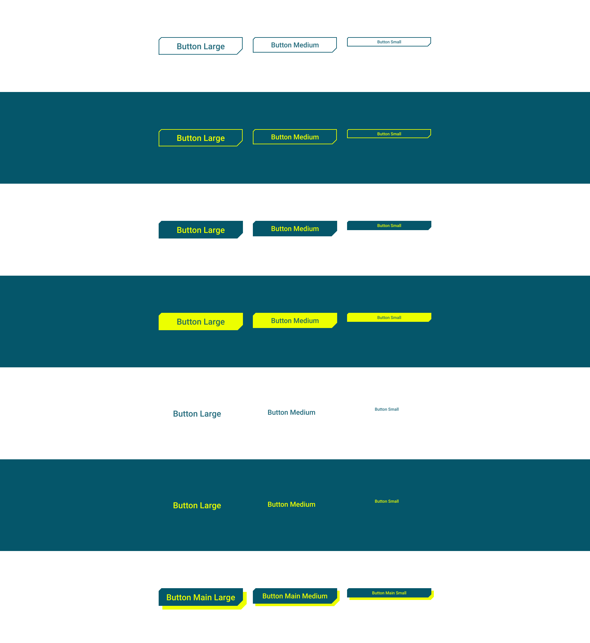
This is how the result of this guide will look like:

It will only need two simple steps for that:

  1. Component Definition, and
  2. Component Creation

For more details about those steps, have a look at the guide about different component processes and their shared structure.

Requirements

This guide assumes that you already have a working Design System, that is based on kickstartDS, running.
If that's not the case, follow our Create your Design System guide.

1. Component Definition

Purpose

There are some straight foward things we'd want to do with a button in our Design System. Most obvious ones would probably be putting a label on it, and making the target of it available for users. If the target is set, the resulting button should look like one, but use the a tag semantically. It should just be a styled, but native, <button> otherwise.

Additionally we'll want to be able to influence the size of a button, and be able to choose from a limited set of variants. We'll use the options offered by kickstartDS 1:1 for the size property (small, medium, large). But for variant we opt to define our own naming, further removing how a button looks from the naming scheme (like outline, clear, etc) and going for straight priority with primary, secondary and tertiary.

Finally, being able to mark a button as disabled should be possible!

Structure

Defining the structure of a component means finding the component API for it:

PropertyTypeDescription
label *stringLabel shown on the button
targetstringTarget that should be linked
variantenumVariant of button used
sizeenumSize the button should be shown in
disabledbooleanWhether the button should be shown as disabled

Fields that should be required are marked with a *.

While directly helping us get a better grasp on our new component, these will also be used to write our JSON Schema later!

2. Component Creation

We like to colocate components. This means to have all involved files next to each other in the same folder; the template (.jsx / .tsx), potential CSS / SASS (.css / .scss), JavaScript (.js / .ts), our JSON Schema component definition (.schema.json), and so on.

So we start by creating the directory src/components/button, from our Design System repository root:


_10
mkdir -p src/components/button

This is the folder we'll add new files to in the coming few paragraphs.

JSON Schema definition

First file we'll create is the JSON Schema definition, encoding the structure we've defined for our component before:

Finished JSON Schema

We'll work our way up to this JSON Schema definition.

src/components/button/button.schema.json

_42
{
_42
"$schema": "http://json-schema.org/draft-07/schema#",
_42
"$id": "http://schema.mydesignsystem.com/button.schema.json",
_42
"title": "Button",
_42
"description": "Component used to for user interaction",
_42
"type": "object",
_42
"properties": {
_42
"label": {
_42
"type": "string",
_42
"title": "Label",
_42
"description": "Text content to display inside the button",
_42
"default": "Read more"
_42
},
_42
"target": {
_42
"type": "string",
_42
"title": "Target",
_42
"description": "Target that should be linked, makes the button behave like a link semantically",
_42
"format": "uri"
_42
},
_42
"size": {
_42
"type": "string",
_42
"enum": ["small", "medium", "large"],
_42
"title": "Size",
_42
"description": "Size of button to use",
_42
"default": "medium"
_42
},
_42
"variant": {
_42
"type": "string",
_42
"enum": ["primary", "secondary", "tertiary"],
_42
"title": "Variant",
_42
"description": "Variant of button to be used",
_42
"default": "secondary"
_42
},
_42
"disabled": {
_42
"type": "boolean",
_42
"title": "Disabled?",
_42
"description": "Whether the button should be disabled",
_42
"default": false
_42
}
_42
},
_42
"required": ["label"]
_42
}

Start with just the boilerplate for a component definition

This includes all necessarily required values for a valid component definition in kickstartDS.

src/components/button/button.schema.json

_10
{
_10
"$schema": "http://json-schema.org/draft-07/schema#",
_10
"$id": "",
_10
"title": "",
_10
"description": "",
_10
"type": "object",
_10
"properties": {}
_10
}

Add basic info describing component

We start by adding a title, description and $id attribute. The correct $id depends on your Design System configuration. We'll assume you've created components before, living under the schema prefix http://schema.mydesignsystem.com.

src/components/button/button.schema.json

_10
{
_10
"$schema": "http://json-schema.org/draft-07/schema#",
_10
"$id": "http://schema.mydesignsystem.com/button.schema.json",
_10
"title": "Button",
_10
"description": "Component used to for user interaction",
_10
"type": "object",
_10
"properties": {}
_10
}

Create label and target fields...

Both fields are straight-forward string type properties, so we just document them a bit!
We do mark target by setting format to uri, though, to enable validation later on.

src/components/button/button.schema.json

_21
{
_21
"$schema": "http://json-schema.org/draft-07/schema#",
_21
"$id": "http://schema.mydesignsystem.com/button.schema.json",
_21
"title": "Button",
_21
"description": "Component used to for user interaction",
_21
"type": "object",
_21
"properties": {
_21
"label": {
_21
"type": "string",
_21
"title": "Label",
_21
"description": "Text content to display inside the button",
_21
"default": "Read more"
_21
},
_21
"target": {
_21
"type": "string",
_21
"title": "Target",
_21
"description": "Target that should be linked, makes the Button behave like a link semantically",
_21
"format": "uri"
_21
}
_21
}
_21
}

... and make label required

We declare label as required on the uppermost object!

src/components/button/button.schema.json

_22
{
_22
"$schema": "http://json-schema.org/draft-07/schema#",
_22
"$id": "http://schema.mydesignsystem.com/button.schema.json",
_22
"title": "Button",
_22
"description": "Component used to for user interaction",
_22
"type": "object",
_22
"properties": {
_22
"label": {
_22
"type": "string",
_22
"title": "Label",
_22
"description": "Text content to display inside the button",
_22
"default": "Read more"
_22
},
_22
"target": {
_22
"type": "string",
_22
"title": "Target",
_22
"description": "Target that should be linked, makes the Button behave like a link semantically",
_22
"format": "uri"
_22
}
_22
},
_22
"required": ["label"]
_22
}

Add allowed sizes 1/2

We add a size property of type string...

src/components/button/button.schema.json

_27
{
_27
"$schema": "http://json-schema.org/draft-07/schema#",
_27
"$id": "http://schema.mydesignsystem.com/button.schema.json",
_27
"title": "Button",
_27
"description": "Component used to for user interaction",
_27
"type": "object",
_27
"properties": {
_27
"label": {
_27
"type": "string",
_27
"title": "Label",
_27
"description": "Text content to display inside the button",
_27
"default": "Read more"
_27
},
_27
"target": {
_27
"type": "string",
_27
"title": "Target",
_27
"description": "Target that should be linked, makes the Button behave like a link semantically",
_27
"format": "uri"
_27
},
_27
"size": {
_27
"type": "string",
_27
"title": "Size",
_27
"description": "Size of button to use"
_27
}
_27
},
_27
"required": ["label"]
_27
}

Add allowed sizes 2/2

... and make it an enum, defining its available options explicitly. We also set a default.

src/components/button/button.schema.json

_29
{
_29
"$schema": "http://json-schema.org/draft-07/schema#",
_29
"$id": "http://schema.mydesignsystem.com/button.schema.json",
_29
"title": "Button",
_29
"description": "Component used to for user interaction",
_29
"type": "object",
_29
"properties": {
_29
"label": {
_29
"type": "string",
_29
"title": "Label",
_29
"description": "Text content to display inside the button",
_29
"default": "Read more"
_29
},
_29
"target": {
_29
"type": "string",
_29
"title": "Target",
_29
"description": "Target that should be linked, makes the Button behave like a link semantically",
_29
"format": "uri"
_29
},
_29
"size": {
_29
"type": "string",
_29
"enum": ["small", "medium", "large"],
_29
"title": "Size",
_29
"description": "Size of button to use",
_29
"default": "medium"
_29
}
_29
},
_29
"required": ["label"]
_29
}

Add allowed variants 1/2

We add a variant property of type string...

src/components/button/button.schema.json

_34
{
_34
"$schema": "http://json-schema.org/draft-07/schema#",
_34
"$id": "http://schema.mydesignsystem.com/button.schema.json",
_34
"title": "Button",
_34
"description": "Component used to for user interaction",
_34
"type": "object",
_34
"properties": {
_34
"label": {
_34
"type": "string",
_34
"title": "Label",
_34
"description": "Text content to display inside the button",
_34
"default": "Read more"
_34
},
_34
"target": {
_34
"type": "string",
_34
"title": "Target",
_34
"description": "Target that should be linked, makes the Button behave like a link semantically",
_34
"format": "uri"
_34
},
_34
"size": {
_34
"type": "string",
_34
"enum": ["small", "medium", "large"],
_34
"title": "Size",
_34
"description": "Size of button to use",
_34
"default": "medium"
_34
},
_34
"variant": {
_34
"type": "string",
_34
"title": "Variant",
_34
"description": "Variant of button to be used"
_34
}
_34
},
_34
"required": ["label"]
_34
}

Add allowed variants 2/2

... and make it an enum, defining its available options explicitly. We also set a default.

src/components/button/button.schema.json

_36
{
_36
"$schema": "http://json-schema.org/draft-07/schema#",
_36
"$id": "http://schema.mydesignsystem.com/button.schema.json",
_36
"title": "Button",
_36
"description": "Component used to for user interaction",
_36
"type": "object",
_36
"properties": {
_36
"label": {
_36
"type": "string",
_36
"title": "Label",
_36
"description": "Text content to display inside the button",
_36
"default": "Read more"
_36
},
_36
"target": {
_36
"type": "string",
_36
"title": "Target",
_36
"description": "Target that should be linked, makes the Button behave like a link semantically",
_36
"format": "uri"
_36
},
_36
"size": {
_36
"type": "string",
_36
"enum": ["small", "medium", "large"],
_36
"title": "Size",
_36
"description": "Size of button to use",
_36
"default": "medium"
_36
},
_36
"variant": {
_36
"type": "string",
_36
"enum": ["primary", "secondary", "tertiary"],
_36
"title": "Variant",
_36
"description": "Variant of button to be used",
_36
"default": "secondary"
_36
}
_36
},
_36
"required": ["label"]
_36
}

Add disabled property

Finally, we add a property disabled, of type boolean.

src/components/button/button.schema.json

_42
{
_42
"$schema": "http://json-schema.org/draft-07/schema#",
_42
"$id": "http://schema.mydesignsystem.com/button.schema.json",
_42
"title": "Button",
_42
"description": "Component used to for user interaction",
_42
"type": "object",
_42
"properties": {
_42
"label": {
_42
"type": "string",
_42
"title": "Label",
_42
"description": "Text content to display inside the button",
_42
"default": "Read more"
_42
},
_42
"target": {
_42
"type": "string",
_42
"title": "Target",
_42
"description": "Target that should be linked, makes the button behave like a link semantically",
_42
"format": "uri"
_42
},
_42
"size": {
_42
"type": "string",
_42
"enum": ["small", "medium", "large"],
_42
"title": "Size",
_42
"description": "Size of button to use",
_42
"default": "medium"
_42
},
_42
"variant": {
_42
"type": "string",
_42
"enum": ["primary", "secondary", "tertiary"],
_42
"title": "Variant",
_42
"description": "Variant of button to be used",
_42
"default": "secondary"
_42
},
_42
"disabled": {
_42
"type": "boolean",
_42
"title": "Disabled?",
_42
"description": "Whether the button should be disabled",
_42
"default": false
_42
}
_42
},
_42
"required": ["label"]
_42
}

Finished JSON Schema

Let's have a look at our completed JSON Schema definition.

src/components/button/button.schema.json

_42
{
_42
"$schema": "http://json-schema.org/draft-07/schema#",
_42
"$id": "http://schema.mydesignsystem.com/button.schema.json",
_42
"title": "Button",
_42
"description": "Component used to for user interaction",
_42
"type": "object",
_42
"properties": {
_42
"label": {
_42
"type": "string",
_42
"title": "Label",
_42
"description": "Text content to display inside the button",
_42
"default": "Read more"
_42
},
_42
"target": {
_42
"type": "string",
_42
"title": "Target",
_42
"description": "Target that should be linked, makes the button behave like a link semantically",
_42
"format": "uri"
_42
},
_42
"size": {
_42
"type": "string",
_42
"enum": ["small", "medium", "large"],
_42
"title": "Size",
_42
"description": "Size of button to use",
_42
"default": "medium"
_42
},
_42
"variant": {
_42
"type": "string",
_42
"enum": ["primary", "secondary", "tertiary"],
_42
"title": "Variant",
_42
"description": "Variant of button to be used",
_42
"default": "secondary"
_42
},
_42
"disabled": {
_42
"type": "boolean",
_42
"title": "Disabled?",
_42
"description": "Whether the button should be disabled",
_42
"default": false
_42
}
_42
},
_42
"required": ["label"]
_42
}

Finished JSON Schema

We'll work our way up to this JSON Schema definition.

Start with just the boilerplate for a component definition

This includes all necessarily required values for a valid component definition in kickstartDS.

Add basic info describing component

We start by adding a title, description and $id attribute. The correct $id depends on your Design System configuration. We'll assume you've created components before, living under the schema prefix http://schema.mydesignsystem.com.

Create label and target fields...

Both fields are straight-forward string type properties, so we just document them a bit!
We do mark target by setting format to uri, though, to enable validation later on.

... and make label required

We declare label as required on the uppermost object!

Add allowed sizes 1/2

We add a size property of type string...

Add allowed sizes 2/2

... and make it an enum, defining its available options explicitly. We also set a default.

Add allowed variants 1/2

We add a variant property of type string...

Add allowed variants 2/2

... and make it an enum, defining its available options explicitly. We also set a default.

Add disabled property

Finally, we add a property disabled, of type boolean.

Finished JSON Schema

Let's have a look at our completed JSON Schema definition.

src/components/button/button.schema.json

_42
{
_42
"$schema": "http://json-schema.org/draft-07/schema#",
_42
"$id": "http://schema.mydesignsystem.com/button.schema.json",
_42
"title": "Button",
_42
"description": "Component used to for user interaction",
_42
"type": "object",
_42
"properties": {
_42
"label": {
_42
"type": "string",
_42
"title": "Label",
_42
"description": "Text content to display inside the button",
_42
"default": "Read more"
_42
},
_42
"target": {
_42
"type": "string",
_42
"title": "Target",
_42
"description": "Target that should be linked, makes the button behave like a link semantically",
_42
"format": "uri"
_42
},
_42
"size": {
_42
"type": "string",
_42
"enum": ["small", "medium", "large"],
_42
"title": "Size",
_42
"description": "Size of button to use",
_42
"default": "medium"
_42
},
_42
"variant": {
_42
"type": "string",
_42
"enum": ["primary", "secondary", "tertiary"],
_42
"title": "Variant",
_42
"description": "Variant of button to be used",
_42
"default": "secondary"
_42
},
_42
"disabled": {
_42
"type": "boolean",
_42
"title": "Disabled?",
_42
"description": "Whether the button should be disabled",
_42
"default": false
_42
}
_42
},
_42
"required": ["label"]
_42
}

This concludes creating the JSON Schema. When running the schema generation in our Design System again, we should now automatically end up with a corresponding type definition to be used in creation of the template in the next step:

src/components/button/ButtonProps.ts
src/components/button/button.schema.json

_41
/* eslint-disable */
_41
/**
_41
* This file was automatically generated by json-schema-to-typescript.
_41
* DO NOT MODIFY IT BY HAND. Instead, modify the source JSONSchema file,
_41
* and run `yarn run schema` to regenerate this file.
_41
*/
_41
_41
/\*\*
_41
_41
- Text content to display inside the button
_41
\*/
_41
export type Label = string;
_41
/\*\*
_41
- Target that should be linked, makes the button behave like a link semantically
_41
\*/
_41
export type Target = string;
_41
/\*\*
_41
- Variant of button to be used
_41
\*/
_41
export type Variant = "primary" | "secondary" | "tertiary";
_41
/\*\*
_41
- Size of button to use
_41
\*/
_41
export type Size = "small" | "medium" | "large";
_41
/\*\*
_41
- Whether the button should be disabled
_41
\*/
_41
export type Disabled = boolean;
_41
_41
/\*\*
_41
_41
- Component used for user interaction
_41
\*/
_41
export interface ButtonProps {
_41
label: Label;
_41
target?: Target;
_41
variant?: Variant;
_41
size?: Size;
_41
disabled?: Disabled;
_41
[k: string]: unknown;
_41
}

How your schema generation is started might change depending on your setup. If you've followed our "Create your Design System" guide before, or want to add it like we do, follow this section of it closely.

React template

As the final step for this example, we'll add the template. This will be a purely functional React component, mapping our component structure (as defined in the JSON Schema) to the original component we're basing our work off of; the kickstartDS Storytelling component.

Finished React template

We'll work our way up to this React template.

src/components/button/ButtonComponent.tsx

_38
import { HTMLAttributes, forwardRef, FC, PropsWithChildren } from "react";
_38
import {
_38
ButtonContextDefault,
_38
ButtonContext,
_38
} from "@kickstartds/base/lib/button";
_38
import { ButtonProps } from "./ButtonProps";
_38
_38
export const Button = forwardRef<
_38
HTMLAnchorElement | HTMLButtonElement,
_38
ButtonProps & HTMLAttributes<HTMLElement>
_38
>(({
_38
label,
_38
target,
_38
size = "medium",
_38
variant = "secondary",
_38
disabled = false,
_38
...props
_38
}, ref) => (
_38
<ButtonContextDefault
_38
{...props}
_38
href={target}
_38
label={label}
_38
size={size}
_38
variant={
_38
variant === 'primary'
_38
? 'solid'
_38
: variant === 'secondary'
_38
? 'outline'
_38
: 'clear'
_38
}
_38
disabled={disabled}
_38
ref={ref}
_38
/>
_38
));
_38
_38
export const ButtonProvider: FC<PropsWithChildren<any>> = (props) => (
_38
<ButtonContext.Provider {...props} value={Button} />
_38
);

Start with a boilerplate

Again we'll start with a very basic skeleton for our React component. We're using TypeScript here (.tsx), but it works the same with plain JSX (.jsx).

src/components/button/ButtonComponent.tsx

_10
import { HTMLAttributes, FC } from "react";
_10
_10
export const Button: FC<HTMLAttributes<HTMLDivElement>> = (
_10
props
_10
) => <div {...props}>Lorem ipsum</div>;

Add correct typings

Import and add generated props from ButtonProps.ts. Generated by our JSON Schema, these guarantee you're matching your expected component structure while implementing. In combination with TypeScript this enables auto-complete and auto-fix for even better DX! (see here, at the very end of that section, for more details)

We also include and forward a reference to the underlying <button> with forwardRef<HTMLAnchorElement | HTMLBUttonElement>, and allow HTMLAttributes<HTMLElement> to be passed to the root element.

src/components/button/ButtonComponent.tsx

_10
import { HTMLAttributes, forwardRef, FC } from "react";
_10
_10
import { ButtonProps } from "./ButtonProps";
_10
_10
export const Button = forwardRef<
_10
HTMLAnchorElement | HTMLButtonElement,
_10
ButtonProps & HTMLAttributes<HTMLElement>
_10
>(({ ...props }, ref) => <button {...props}>Lorem ipsum</button>;

Destructure props

We also need to add our own properties, so we'll destructure props. We add our default values here, too. We'll just pass through everything HTMLAttributes related!

src/components/button/ButtonComponent.tsx

_17
import { HTMLAttributes, forwardRef, FC } from "react";
_17
_17
import { ButtonProps } from "./ButtonProps";
_17
_17
export const Button = forwardRef<
_17
HTMLAnchorElement | HTMLButtonElement,
_17
ButtonProps & HTMLAttributes<HTMLElement>
_17
>(({
_17
label,
_17
target,
_17
size = "medium",
_17
variant = "secondary",
_17
disabled = false,
_17
...props
_17
}, ref) => (
_17
<button {...props}>Lorem ipsum</button>
_17
));

Add Button component 1/5

Now we'll import and add the kickstartDS Button component. To start, we'll use the hard-coded properties of the solid Button variant from our kickstartDS Design System.

src/components/button/ButtonComponent.tsx

_31
import { HTMLAttributes, forwardRef, FC } from "react";
_31
import {
_31
ButtonContextDefault,
_31
} from "@kickstartds/base/lib/button";
_31
_31
import { ButtonProps } from "./ButtonProps";
_31
_31
export const Button = forwardRef<
_31
HTMLAnchorElement | HTMLButtonElement,
_31
ButtonProps & HTMLAttributes<HTMLElement>
_31
>(({
_31
label,
_31
target,
_31
size = "medium",
_31
variant = "secondary",
_31
disabled = false,
_31
...props
_31
}, ref) => (
_31
<ButtonContextDefault
_31
href="#"
_31
icon={{
_31
className: undefined,
_31
icon: undefined,
_31
role: undefined
_31
}}
_31
label="mehr erfahren"
_31
size="medium"
_31
type="button"
_31
variant="solid"
_31
/>
_31
));

Add Button component 2/5

We remove all of the unneeded stuff, as there are a bunch of properties that are completely optional, mainly those having their values undefined or null in the copied JSX, or ones which just state the default value of that property anyway. Those can be freely removed.

src/components/button/ButtonComponent.tsx

_25
import { HTMLAttributes, forwardRef, FC } from "react";
_25
import {
_25
ButtonContextDefault,
_25
} from "@kickstartds/base/lib/button";
_25
_25
import { ButtonProps } from "./ButtonProps";
_25
_25
export const Button = forwardRef<
_25
HTMLAnchorElement | HTMLButtonElement,
_25
ButtonProps & HTMLAttributes<HTMLElement>
_25
>(({
_25
label,
_25
target,
_25
size = "medium",
_25
variant = "secondary",
_25
disabled = false,
_25
...props
_25
}, ref) => (
_25
<ButtonContextDefault
_25
href="#"
_25
label="mehr erfahren"
_25
size="medium"
_25
variant="solid"
_25
/>
_25
));

Add Button component 3/5

We then connect the props as defined in our component API that are directly taken from the underlying kickstartDS base component by just passing them through. We also destructure props first, so our own properties take precedence when set, and pass ref off to the base component.

src/components/button/ButtonComponent.tsx

_28
import { HTMLAttributes, forwardRef, FC } from "react";
_28
import {
_28
ButtonContextDefault,
_28
} from "@kickstartds/base/lib/button";
_28
_28
import { ButtonProps } from "./ButtonProps";
_28
_28
export const Button = forwardRef<
_28
HTMLAnchorElement | HTMLButtonElement,
_28
ButtonProps & HTMLAttributes<HTMLElement>
_28
>(({
_28
label,
_28
target,
_28
size = "medium",
_28
variant = "secondary",
_28
disabled = false,
_28
...props
_28
}, ref) => (
_28
<ButtonContextDefault
_28
{...props}
_28
href="#"
_28
label={label}
_28
size={size}
_28
variant="solid"
_28
disabled={disabled}
_28
ref={ref}
_28
/>
_28
));

Add Button component 4/5

We renamed href to target in our component API, so we add that in its renamed form.

src/components/button/ButtonComponent.tsx

_28
import { HTMLAttributes, forwardRef, FC } from "react";
_28
import {
_28
ButtonContextDefault,
_28
} from "@kickstartds/base/lib/button";
_28
_28
import { ButtonProps } from "./ButtonProps";
_28
_28
export const Button = forwardRef<
_28
HTMLAnchorElement | HTMLButtonElement,
_28
ButtonProps & HTMLAttributes<HTMLElement>
_28
>(({
_28
label,
_28
target,
_28
size = "medium",
_28
variant = "secondary",
_28
disabled = false,
_28
...props
_28
}, ref) => (
_28
<ButtonContextDefault
_28
{...props}
_28
href={target}
_28
label={label}
_28
size={size}
_28
variant="solid"
_28
disabled={disabled}
_28
ref={ref}
_28
/>
_28
));

Add Button component 5/5

Finally we have to remap the values for variant, because we've actually renamed the values here.

src/components/button/ButtonComponent.tsx

_34
import { HTMLAttributes, forwardRef, FC } from "react";
_34
import {
_34
ButtonContextDefault,
_34
} from "@kickstartds/base/lib/button";
_34
_34
import { ButtonProps } from "./ButtonProps";
_34
_34
export const Button = forwardRef<
_34
HTMLAnchorElement | HTMLButtonElement,
_34
ButtonProps & HTMLAttributes<HTMLElement>
_34
>(({
_34
label,
_34
target,
_34
size = "medium",
_34
variant = "secondary",
_34
disabled = false,
_34
...props
_34
}, ref) => (
_34
<ButtonContextDefault
_34
{...props}
_34
href={target}
_34
label={label}
_34
size={size}
_34
variant={
_34
variant === 'primary'
_34
? 'solid'
_34
: variant === 'secondary'
_34
? 'outline'
_34
: 'clear'
_34
}
_34
disabled={disabled}
_34
ref={ref}
_34
/>
_34
));

Add component Provider

We want our Button to replace all default kickstartDS base Buttons, no matter where they appear. We add a Provider for that purpose now!

src/components/button/ButtonComponent.tsx

_39
import { HTMLAttributes, forwardRef, FC, PropsWithChildren } from "react";
_39
import {
_39
ButtonContextDefault,
_39
ButtonContext,
_39
} from "@kickstartds/base/lib/button";
_39
_39
import { ButtonProps } from "./ButtonProps";
_39
_39
export const Button = forwardRef<
_39
HTMLAnchorElement | HTMLButtonElement,
_39
ButtonProps & HTMLAttributes<HTMLElement>
_39
>(({
_39
label,
_39
target,
_39
size = "medium",
_39
variant = "secondary",
_39
disabled = false,
_39
...props
_39
}, ref) => (
_39
<ButtonContextDefault
_39
{...props}
_39
href={target}
_39
label={label}
_39
size={size}
_39
variant={
_39
variant === 'primary'
_39
? 'solid'
_39
: variant === 'secondary'
_39
? 'outline'
_39
: 'clear'
_39
}
_39
disabled={disabled}
_39
ref={ref}
_39
/>
_39
));
_39
_39
export const ButtonProvider: FC<PropsWithChildren<any>> = (props) => (
_39
<ButtonContext.Provider {...props} value={Button} />
_39
);

Finished React template

Let's have a look at our completed React template.

src/components/button/ButtonComponent.tsx

_39
import { HTMLAttributes, forwardRef, FC, PropsWithChildren } from "react";
_39
import {
_39
ButtonContextDefault,
_39
ButtonContext,
_39
} from "@kickstartds/base/lib/button";
_39
_39
import { ButtonProps } from "./ButtonProps";
_39
_39
export const Button = forwardRef<
_39
HTMLAnchorElement | HTMLButtonElement,
_39
ButtonProps & HTMLAttributes<HTMLElement>
_39
>(({
_39
label,
_39
target,
_39
size = "medium",
_39
variant = "secondary",
_39
disabled = false,
_39
...props
_39
}, ref) => (
_39
<ButtonContextDefault
_39
{...props}
_39
href={target}
_39
label={label}
_39
size={size}
_39
variant={
_39
variant === 'primary'
_39
? 'solid'
_39
: variant === 'secondary'
_39
? 'outline'
_39
: 'clear'
_39
}
_39
disabled={disabled}
_39
ref={ref}
_39
/>
_39
));
_39
_39
export const ButtonProvider: FC<PropsWithChildren<any>> = (props) => (
_39
<ButtonContext.Provider {...props} value={Button} />
_39
);

Finished React template

We'll work our way up to this React template.

Start with a boilerplate

Again we'll start with a very basic skeleton for our React component. We're using TypeScript here (.tsx), but it works the same with plain JSX (.jsx).

Add correct typings

Import and add generated props from ButtonProps.ts. Generated by our JSON Schema, these guarantee you're matching your expected component structure while implementing. In combination with TypeScript this enables auto-complete and auto-fix for even better DX! (see here, at the very end of that section, for more details)

We also include and forward a reference to the underlying <button> with forwardRef<HTMLAnchorElement | HTMLBUttonElement>, and allow HTMLAttributes<HTMLElement> to be passed to the root element.

Destructure props

We also need to add our own properties, so we'll destructure props. We add our default values here, too. We'll just pass through everything HTMLAttributes related!

Add Button component 1/5

Now we'll import and add the kickstartDS Button component. To start, we'll use the hard-coded properties of the solid Button variant from our kickstartDS Design System.

Add Button component 2/5

We remove all of the unneeded stuff, as there are a bunch of properties that are completely optional, mainly those having their values undefined or null in the copied JSX, or ones which just state the default value of that property anyway. Those can be freely removed.

Add Button component 3/5

We then connect the props as defined in our component API that are directly taken from the underlying kickstartDS base component by just passing them through. We also destructure props first, so our own properties take precedence when set, and pass ref off to the base component.

Add Button component 4/5

We renamed href to target in our component API, so we add that in its renamed form.

Add Button component 5/5

Finally we have to remap the values for variant, because we've actually renamed the values here.

Add component Provider

We want our Button to replace all default kickstartDS base Buttons, no matter where they appear. We add a Provider for that purpose now!

Finished React template

Let's have a look at our completed React template.

src/components/button/ButtonComponent.tsx

_38
import { HTMLAttributes, forwardRef, FC, PropsWithChildren } from "react";
_38
import {
_38
ButtonContextDefault,
_38
ButtonContext,
_38
} from "@kickstartds/base/lib/button";
_38
import { ButtonProps } from "./ButtonProps";
_38
_38
export const Button = forwardRef<
_38
HTMLAnchorElement | HTMLButtonElement,
_38
ButtonProps & HTMLAttributes<HTMLElement>
_38
>(({
_38
label,
_38
target,
_38
size = "medium",
_38
variant = "secondary",
_38
disabled = false,
_38
...props
_38
}, ref) => (
_38
<ButtonContextDefault
_38
{...props}
_38
href={target}
_38
label={label}
_38
size={size}
_38
variant={
_38
variant === 'primary'
_38
? 'solid'
_38
: variant === 'secondary'
_38
? 'outline'
_38
: 'clear'
_38
}
_38
disabled={disabled}
_38
ref={ref}
_38
/>
_38
));
_38
_38
export const ButtonProvider: FC<PropsWithChildren<any>> = (props) => (
_38
<ButtonContext.Provider {...props} value={Button} />
_38
);

To complete the template we add the ButtonProvider to our src/components/Providers.jsx:

src/components/Providers.jsx

_14
import { ButtonProvider } from "./button/ButtonComponent";
_14
import { SectionProvider } from "./section/SectionComponent";
_14
import { TeaserBoxProvider } from "./teaser-card/TeaserCardComponent";
_14
import { HeadlineProvider } from "./headline/HeadlineComponent";
_14
_14
export default (props) => (
_14
<ButtonProvider>
_14
<HeadlineProvider>
_14
<SectionProvider>
_14
<TeaserBoxProvider {...props} />
_14
</SectionProvider>
_14
</HeadlineProvider>
_14
</ButtonProvider>
_14
);

This concludes the creation of our new Button component. It's now ready to be used inside your Design System, and available to your down stream consumers... hopefully efficiently closing a gap for them!

Use of Storybook

If you're using Storybook, you can follow this part of the example to get all the integration goodness possible with kickstartDS!

Storybook setup

This guide assumes you're using a set up like described in our Create your Design System guide! Be sure to adapt commands and configuration to your use accordingly, when following this part!

Add the following file to your src/components/button folder:

Import Button component

Import Button component and add it to the Template that we'll bind Stories to.

Import Storybook Controls helpers

Import dereferenced component JSON Schema and getArgsShared helper to generate Storybook Controls, and parameterize Storybook JSON Schema Addon.

Import re-usable Button Stories...

We import the existing Button Story part of @kickstartDS/base, to re-use all the default settings.

... and overwrite values where needed

We set all the Story defaults specific to our component.

Convert args to flat keys

We use pack to convert all deep JSON args to flat (. delimited) keys and values. This is the format your Storybook Controls get generated off.

Create Button variants

We do this by binding to our Template, and use pack to convert all deep JSON args to flat (. delimited) keys and values. This is the format your Storybook Controls get generated off.

src/components/button/Button.stories.jsx

_56
import { Button } from "./ButtonComponent";
_56
import { pack, getArgsShared } from "@kickstartds/core/lib/storybook";
_56
import ButtonStories from "@kickstartds/base/lib/button/button.stories";
_56
import schema from "./button.schema.dereffed.json";
_56
_56
const { args, argTypes } = getArgsShared(schema);
_56
_56
const Template = (args) => <Button {...args} />;
_56
_56
export default {
_56
...ButtonStories,
_56
title: "Components/Button",
_56
args,
_56
argTypes,
_56
parameters: {
_56
jsonschema: schema,
_56
},
_56
};
_56
_56
export const NativeButton = Template.bind({});
_56
NativeButton.args = pack({
_56
label: "Native Button",
_56
variant: "primary",
_56
});
_56
_56
export const LinkButton = Template.bind({});
_56
LinkButton.args = pack({
_56
label: "Link Button",
_56
variant: "secondary",
_56
target: "#",
_56
});
_56
_56
export const DisabledButton = Template.bind({});
_56
DisabledButton.args = pack({
_56
label: "Disabled Button",
_56
variant: "primary",
_56
disabled: true,
_56
});
_56
_56
export const PrimaryButton = Template.bind({});
_56
PrimaryButton.args = pack({
_56
label: "Primary Button",
_56
variant: "primary",
_56
});
_56
_56
export const SecondaryButton = Template.bind({});
_56
SecondaryButton.args = pack({
_56
label: "Secondary Button",
_56
variant: "secondary",
_56
});
_56
_56
export const TertiaryButton = Template.bind({});
_56
TertiaryButton.args = pack({
_56
label: "Tertiary Button",
_56
variant: "tertiary",
_56
});

If you reopen your Storybook now, or if you kept it running while following along, you should now see your new Button in all its glory!

Finished Code Sandbox

You can also have a look at the completed component in the following Code Sandbox:

Toggle the file browser with the hamburger icon at the top left, or open it directly in your browser.


_10


_10