Premade Stories
Stories are at the heart of Storybook (who whould've guessed 😅). They are the stage and workbench for your components. As with Storybook Controls you don't have to start from zero with kickstartDS.

Usage with kickstartDS
We provide support in two key areas when it comes to Storybook stories:
- Premade Design Token stories
- Premade component stories
See below for an explanation what these can do for you!
1. Premade Design Token stories
Our premade Design Token stories showcase your Design Token set instantly, neatly categorized and grouped by their semantic meaning established through kickstartDS.
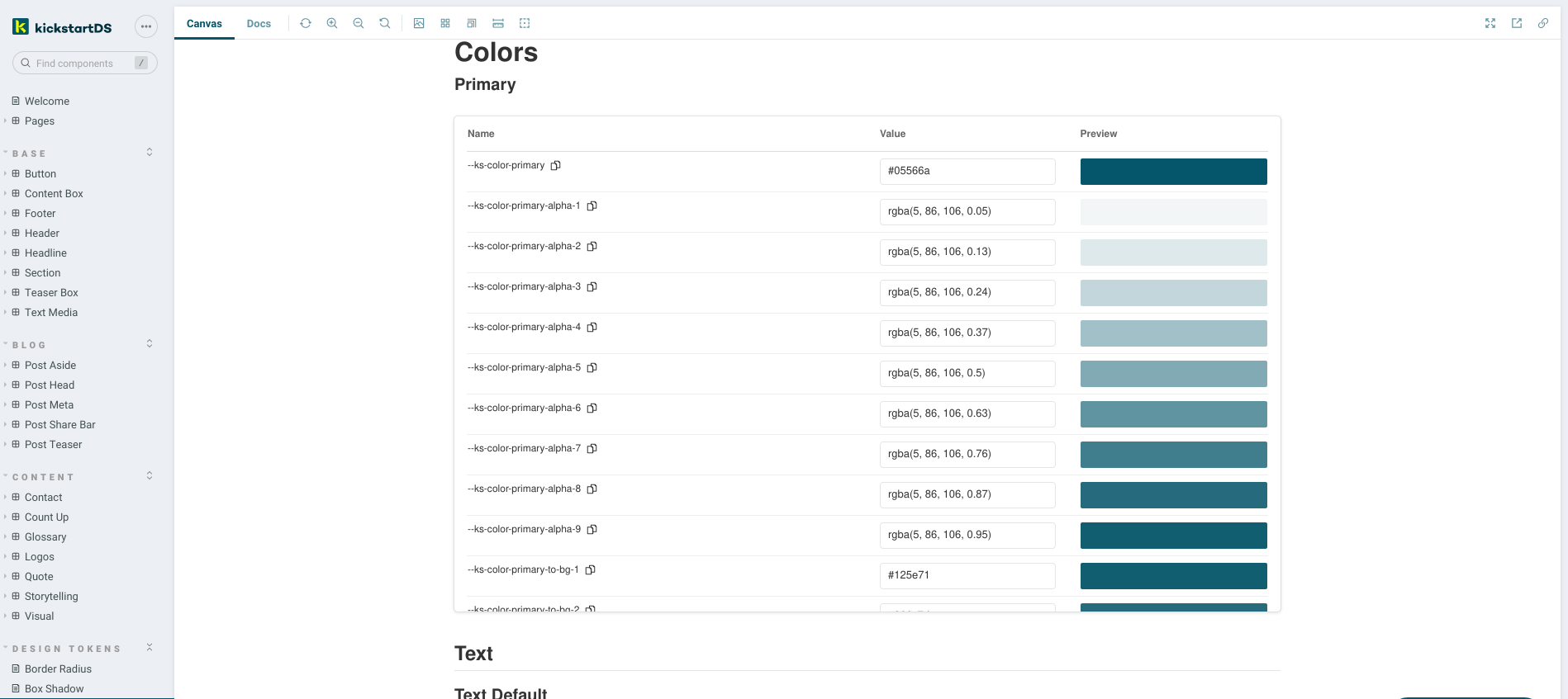
See the integration page about "Design & Component Token" in this very section to see a detailed description, and how you'd use them for your own Design System.
2. Premade component stories
When building your own components based on kickstartDS, often you'll find that there's one single component, or a very limited set of components, that back your new creation. It'd make sense to re-use existing documentation for those, too!
To enable re-use, we export stories as part of every component that's part of our modules. You can simply import those to set useful defaults for your own component stories, inheriting from the base component.
Simple example Button
Let's see how this would look like when building a story for your own, hypothetical Button component (based on the @kickstartDS/base component Button):
Import existing stories
First we import the existing ButtonStories from @kickstartds/base.
Add them as defaults
Destructure them into your default export as defaults, and overwrite just what you want to need to.
That's it, and as always this should help you focus on the important details! Have a look at the "Adapt Button component" guide for a full version of the Button component shown here.
This also works when working with more than one component:
Complex example Glossary detail page
This will be added soon, come back a bit later!
Woöö ise this page as a basis: https://github.com/kickstartDS/kickstartDS-storybook/blob/master/src/Pages/BlogList.story.jsx
In action
To see this in action, have a look at the base story for our kickstartDS Button component, for example:
https://master--6080932e6ca776002127f0c5.chromatic.com/?path=/story/base-button--default
Then compare it to the story for the Button in our own kickstartDS Design System (which, of course, is also based on kickstartDS), which re-uses the base story from above:
https://www.kickstartds.com/storybook/?path=/story/base-button--solid