kickstartDS Design System Starter
About
The kickstartDS Design System Starter is your most efficient way of kickstarting a Design System. It creates a ready-to-use Design System, only waiting for you to put your stamp on it! Next to some additional features and configuration, the content of this starter is strongly aligned with our main guide "Create your Design System". This means you can use that guide as a detailed reference for the way stuff works, and learn about the reasoning behind those decisions.
Overview
This Starter repository can serve as the starting point for your own Design System. It only includes minimal, but illustrative, example components and integrations. The selected components should be useful in every Design System by themselves, but they're specifically used to showcase features and best practices at play in kickstartDS, and to make it easier for you to just add stuff to an already working, well-oiled system.
We have extensive documentation building up most of the code you'll find in this starter from scratch. The respective guide "Create your Design System" can thus serve as a great reference whilst exploring this starter on your own, or when having specific questions about a feature or integration.
Feature list
The following is a list of included features, that are pre-configured for immediate use:
- Ready-to-start, fully functional Design System
- Pre-configured semantic token structure (Branding Token, Design Token and Component Token)
- Branding Token file for quick application of CI / CD
- Three exemplary components (
Button,HeadlineandTeaserCard) and a layout element (Section) - Full page demo, recipe demo and rudimentary demo docs
- Storybook with best-practice configuration, kickstartDS integration, addons and composition
- Hot reload for all code changes: Design Token set, JSON Schema, CSS / SCSS, JavaScript and React templates
- Playroom integration for prototyping
- Bundling of Design System for use with and without React
- Automatic, semantic release handling using auto
- CI / CD integration for Circle CI
See the dedicated section about the main features below for more detailed descriptions.
Installation
There's not really anything you need to install globally to use kickstartDS. But as it is Node.js based, you'll have to have that at the ready. This starter (just like the rest of kickstartDS) tracks the current LTS release, switching to new ones as soon as all the tooling has stabilized.
Install Node.js with nvm
We recommend managing your local Node.js versions using nvm. Read through the corresponding section in our docs.
To learn more generally about the optimal environment to work with kickstartDS have a look at the Environment page in our docs.
Getting started (in 5 minutes)
Let's get started creating your own Design System! We should be done with the basic setup in just 5 easy steps, taking you 5 minutes max!
1. Create from template
First thing is creating your repository based on this template. This will be the repository you manage your Design System in, your central source of truth!
Just follow this excellent guide by Github themselves:
Creating a repository from a template
Alternatively you can also just fork / clone the repository, and host your code how- and wherever you like. There's no further dependency on Github here... it's just convenient.
As a last step, simply clone your freshly made repository, and switch into its directory in preparation for the next step.
Clone? Directory? Huh...
Not sure where anything like this would happen? Have a look at the "Terminal" section in our docs.
2. Update package.json
After checkout, you should start by adding some meta info to package.json... like name for the name of your project. Among other things, this will also decide the name your Design System will be published under in npm. Other fields you might want to change include: version, description, homepage, license and author. Have a look at the npm docs for package.json for all the juicy details.
And while at it, you should probably also change the author in the following files:
COPYRIGHT.mdLICENSE-APACHELICENSE-MITREADME.md.autorc
3. Add your own logo
Last thing to do before installing and starting everything is to replace the placeholder logo with your own one. Just replace static/logo.svg, and you should be good to go!
Other image formats
If you don't have a .svg file for your logo (you really should have one!),
you can just put that file into the static/ folder, and change the reference
in .storybook/themes.js to point to that instead.
4. Install dependencies
Continue by checking your Node.js version (or execute nvm use if you opted for the nvm route) with node --version. It should output 16.14 for this starter.
Follow this with a yarn or npm install:
_10yarn install
_10npm install
This should set up all the needed dependencies. It could take a while the first time around, so while that's running... why not take a peek at the features section?
Using npm
We use yarn for package management ourselves, including their workspaces feature...
Just replace commands prefixed with yarn by their corresponding npm equivalents if using npm
5. Start Storybook
When the installation of dependencies is done, everything should be ready to start your own Design System for the very first time:
_10yarn start
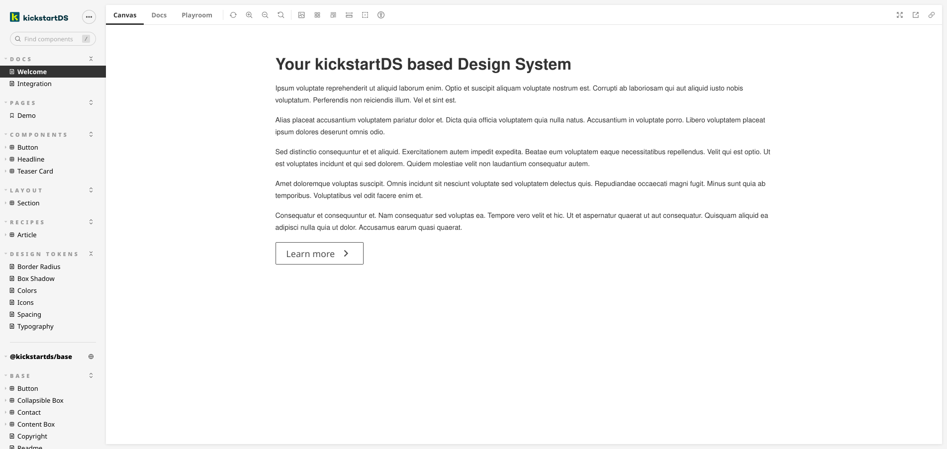
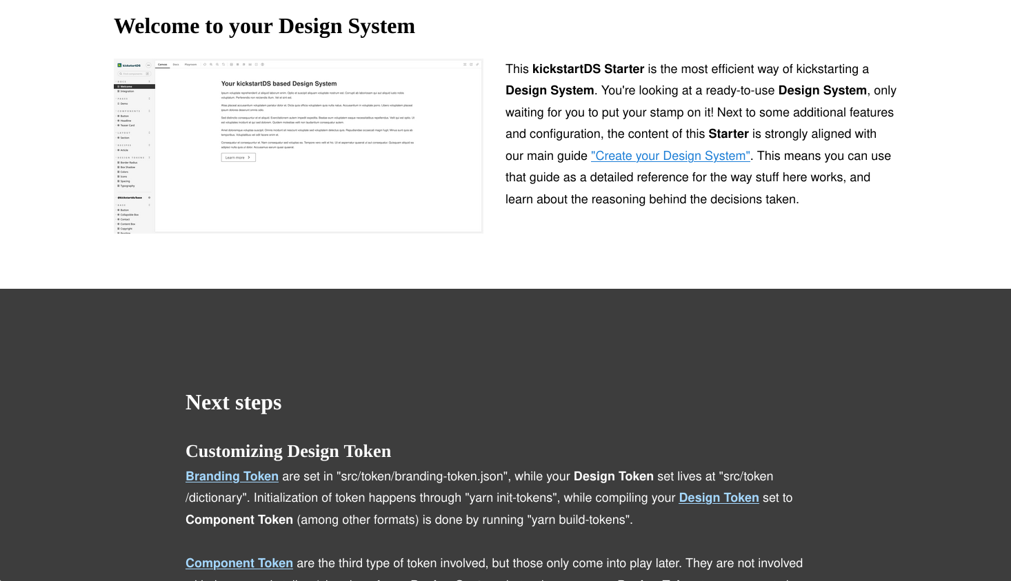
Storybook should automatically open in your preferred browser, showing you a demo "Welcome" page with some dummy content.
yarn start here is actually an alias starting all configured watch tasks, in parallel to also starting Storybook in watch mode. This ensures that whatever file you edit, you should have hot reload while working on your code!
Have a look at the next section for inspiration on what the next steps could look like on the journey to your customized Design System.
Next steps
Where you take it next is pretty much up to you completely. There are some things one would pretty much always want to do (e.g. Customizing Design Token), while others might be optional. In which order you tackle those shouldn't make a difference, just choose what fancies you the most!
Customizing Design Token
When getting started with your Design System, you will find the current Design Token set to be pretty bland and boring... this is because you are looking at the default, pretty much unstyled versions of components.
There are two concepts involved with design and token application in kickstartDS:
- Branding Token: Small set of expressive values to seed your initial Design Token set
- Design Token: Managed Style Dictionary containing your semantic Design Token set
Branding Token are set in src/token/branding-token.json, while your Design Token set lives at src/token/dictionary. Initialization of token happens through yarn init-tokens, while compiling your Design Token set to Component Token (among other formats) is done by running yarn build-tokens.
Component Token are the third type of token involved, but those only come into play later. They are not concerned with the general styling / theming of your Design System, but rather map your Design Token set to components in a layered way.
To learn more about this process, follow the section "2. Design Application" of our "Create your Design System" guide.
Adding components
As described in the intro to this README, the components already included serve as a great example on how to leverage kickstartDS. But obviously you will want to add your own components, suited to exactly your needs!
We have to tried to outline this process of component creation, and all its aspects, in our documentation. All the components included with this starter get created in part of "4. Add Components" of our main guide "Create your Design System". You can use that guide to cross-reference the thought process behind the components already included, and it should give you a good idea on how to approach your own ones.
You can have a look at all the component examples in our guides here, or learn about the involved processes in more detail in the "Components" subsection.
Futher, all the aspects making up a component are described as part of the "Component" subsection under "Foundations".
If unsure on what components you actually need, or which ones to tackle first, you could investigate starting your own Design System Initiative. We also wrote about it in a blog post, and offer support in executing one... if you still feel like you need a helping hand!
Dig into our docs
We have added a lot of links to specific docs sections in all the other paragraphs already. But they deserve a special mention here. Creating a Design System can be both highly custom and opinionated. This is why we think explaining our reasoning in detail, especially when we take decisions for you (like using Style Dictionary), is super important. And for areas where there is no clear cut decision to take, we always try to add recommendations (like how to best construct your components to avoid adding technical debt) instead.
Some quick links to get you started:
| Link | Description |
|---|---|
| https://www.kickstartds.com/docs/ | Start page, good intro to the general structure of our docs |
| https://www.kickstartds.com/docs/intro/ | Super general introduction of kickstartDS, including YouTube explanation |
| https://www.kickstartds.com/docs/foundations/ | Foundational info about the structure and architecture of kickstartDS |
| https://www.kickstartds.com/docs/integration/ | Info about the ways kickstartDS integrates with other tooling and systems |
| https://www.kickstartds.com/docs/guides/ | Focused guides, categorized into the main areas of a Design System |
| https://www.kickstartds.com/docs/guides/create/ | Main guide, also a great reference for the reasoning behind this starter |
| https://www.kickstartds.com/docs/feedback/ | All the ways you can provide feedback to us, which we value a lot! |
Features
This starter is already quite rich in features that are enabled out-of-the-box for you. To give you some orientation, while also describing the intention behind features, and ensuring you can actually make the most out of your Design System.
Design Token integration
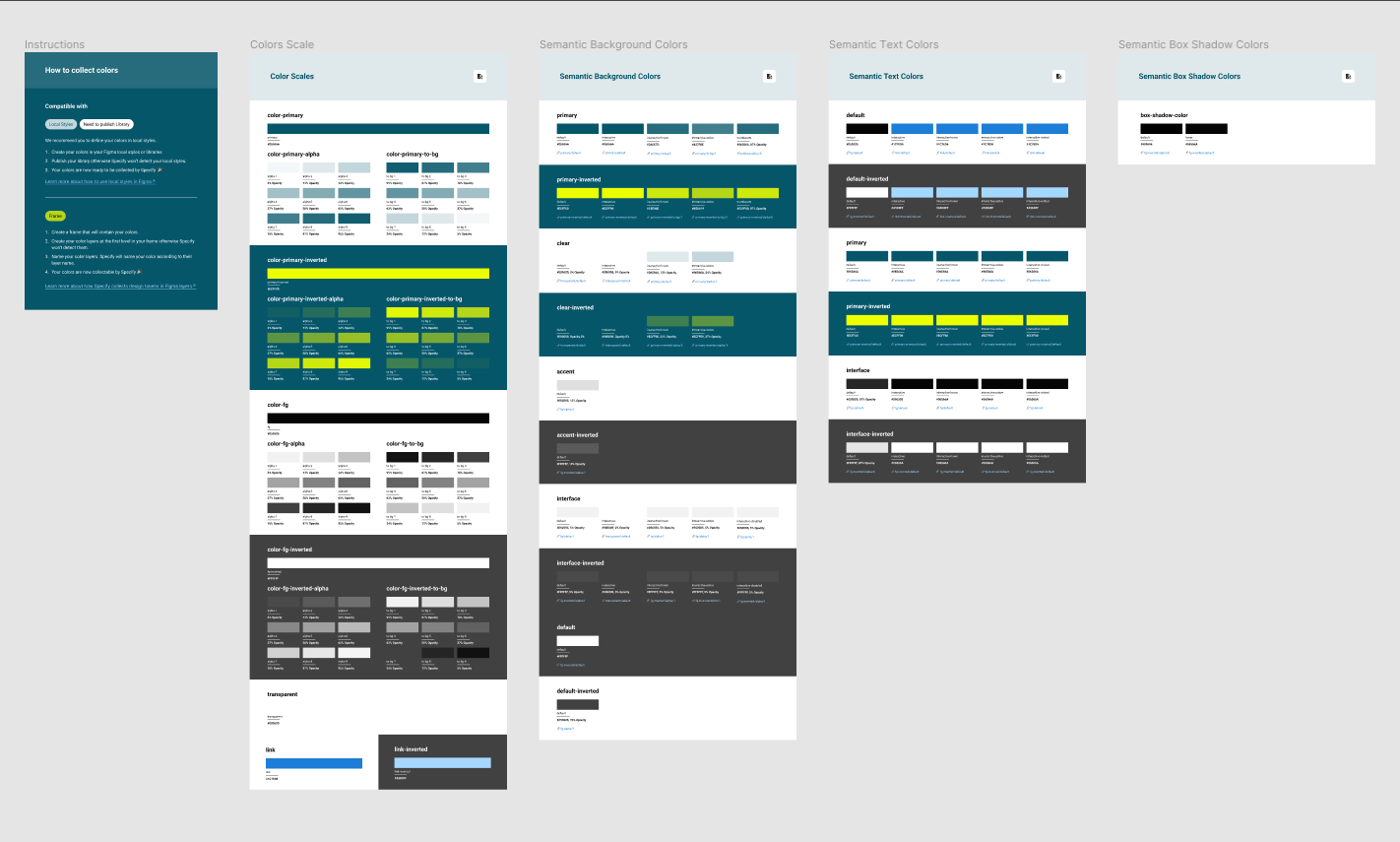
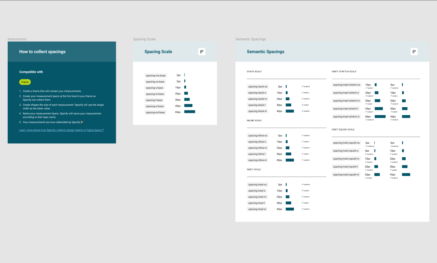
One important part of a Design System is having a well structured and semantic token system in place. Learn about customizing your Design Token set in our dedicated section above, helping you to adapt your own branding / CI / CD.
Design Token can be initialized by changing the values in src/token/branding-token.json and calling yarn init-tokens, and compiled to CSS Custom Properties by running yarn build-tokens. While yarn init-tokens generates your Design Token set in src/token/dictionary, yarn build-tokens reads it from there, and outputs the resulting formats (which CSS Custom Properties is just one of) according to your Style Dictionary config.
We already include a minimal Style Dictionary configuration as part of our CLI, but you can overwrite this configuration by adding a sd.config.cjs to your repository root. Explore that file for details on the formats configured in this starter (the path the format output is written to can be influenced by setting buildPath):
| Platform | Description |
|---|---|
| css | Creates a token.css file including all of your Design Token converted to CSS Custom Properties, using the naming structure expected by Component Token in src/token |
| html | HTML icon sprite (learn more), that is needed when integrating raw HTML (e.g. into PHP, ASP.NET, or similar). Also serves as the central icon file read by the storybook-design-token addon. Added as icon-sprite.html in src/token/icons |
| jsx | React version of the same file as the one above, this should be used when working with React directly. Called IconSprite.js in src/token/icons |
| storybook | Writes a selection of files (icons.svg, tokens.css) to src/token/storybook. Those are versions of files already described above, but with automatically added annotations for the storybook-design-token addon |
| js | This also creates a file (src/token/storybook/tokens.js) only used by Storybook, to add some light theming to your instance based on your Design Token set. |
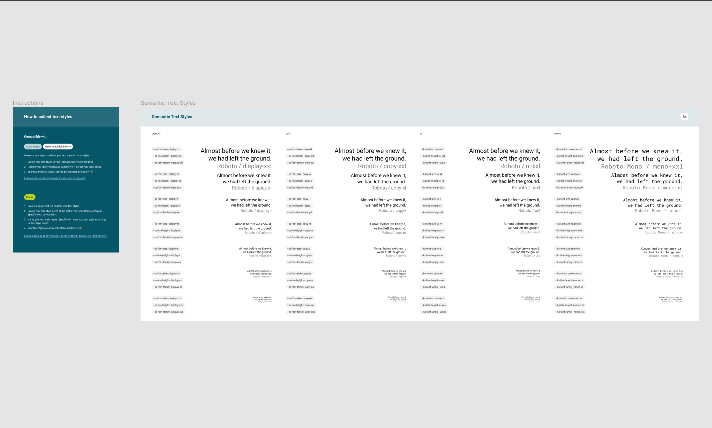
Also included is a set of Storybook pages documenting your Design Token set, using aforementioned storybook-design-token addon. You can find them in docs/tokens, feel free to adjust them to your liking!
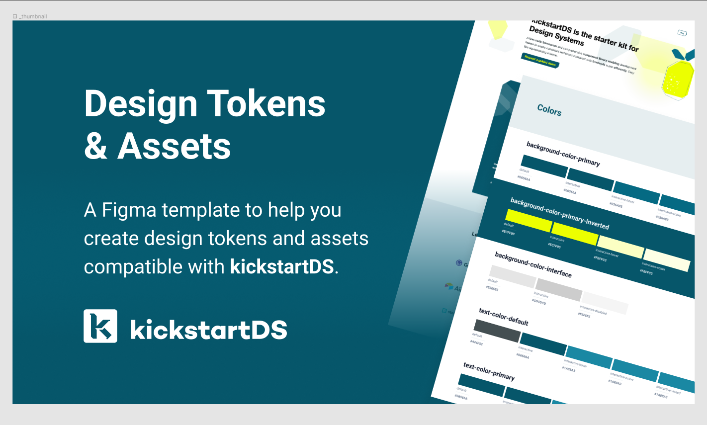
You can also have a look at our Figma token file visualizing exactly that token structure:
To learn more about Design Token and their support in kickstartDS read our first release spotlight: Release Spotlight: Semantic Token.
Storybook integration
Some aspects of our integration with Storybook were already covered by the last section about Design Token integration. But let's quickly outline all of the integration points:
| Integration | Description |
|---|---|
| JSON Schema | Storybook addon written by us, to display your component API directly alongside your component (includes inline JSON editor using Monaco, with auto-complete). |
| Design Token | Integration with storybook-design-token addon, read more about it on our integration page about it. Also included are Storybook pages documenting your Design Token set... you can find them in docs/tokens. |
| Component Token | Another Storybook addon we made. Visualizes your layered Component Token, and enables changing values interactively. Changed values get stored in session storage, allowing you to test them throughout your whole Design System. |
| Generated Controls | Your component API (JSON Schema files defining your components structure) get converted to Storybook Controls automatically. Learn more about this zero-config setup in our dedicated integrations page about it. |
| Premade Stories | Especially when adapting components closely, you can benefit from our Storybook exports. We take great care to export everything (parameters, variants, general setup) for you to re-use while writing your own Stories. |
| Theming | Finally some light theming gets applied to your Storybook instance, based on your Design Token set. It should be subdued, but making Storybook your own really helps in establishing a sense of ownership! |
| Composition | As part of the left sidebar you have a section titled @kickstartds/base, at the very bottom. This gets shown because @kickstartds/base is a dependency. kickstartDS uses Storybook composition to always include the base documentation (in the correct version used by your Design System) to your Storybook. |
Design Token get compiled using the kickstartDS CLI as part of your package.json. This converts your Style Dictionary from src/token/dictionary into all the formats configured in sd.config.cjs. Storybook is configured to import our special, annotated src/token/storybook/tokens.css (this one includes presenters for storybook-design-token) through the import of the compiled manager.css.
Theming is done in .storybook/themes.js, and works by importing our tokens (generated with their own special Style Dictionary format). Those then just get connected into the Storybook theme structure in a sensible way.
All the other integrations don't live at one central place, but instead require configuration per component / Story. So lets look at an example in the Button component instead:
- JSON Schema integration for the
Button, loading the dereferenced schema, setting it as a Story parameter, and using thepackhelper throughoutButton.stories.jsx. The rest is handled by our Storybook JSON Schema Addon. - Component Token are integrated by importing the generated
button-tokens.json, and then passing that as a parameter to the Story. Generation of those files per component is done inpackage.jsonhere. The rest is handled again by our own addon: Storybook Component Tokens Addon. - Generated Controls are enabled by importing the helpers
getArgsSharedandpack, and using them throughout the Story. This takes care of generating all the Storybook Controls automatically for you, based off your component APIs (the JSON Schema definitions). - Premade stories work by importing the base Story first, and then destructuring it into the default export... before setting your own options as overrides.
React integration
There are some React concepts already in use deep in kickstartDS, and its base components you build upon. This includes using Render Props and adding Context / Provider to all components, both to enable flexible and efficient mix-and-match of components.
You can see some examples on how this can be applied in our docs about it. Those concepts also get used throughout our main guide "Create your Design System", for example when adding RTE-rendering to the Headline. All components included in this starter are the result of example guides.
This also easily enables more advanced integrations for your components to offer, later on. For example, when integrating with a headless CMS like Sanity, and using existing Render Props to turn our default Markdown capable RichText component to one specific to Sanity, using PortableText.
For this starter this means having a file src/Providers.jsx in place, that includes all the needed Providers to replace the base components by their customized versions throughout your whole Design System. As we've added our own versions of the Button, TeaserBox and Section components in this starter, those are imported and added. We also support Bedrock Layout Primitives out-of-the-box, so that provider gets added, too. You can read more about the Provider setup in one of our guides here.
Providers need to be set for Storybook, both for previews and the Docs container to render components properly. This, too, is covered by our main guide here.
When you need Providers
When you're building a page or application using React, you will need to
add those Providers to your central layout there!
Bedrock Layout Primitives integration
For the most common use cases we include the Section component with kickstartDS, and it's adapted for this Design System starter, too. It even includes some customizations here, as described in our component example guide "Extend Section component`.
The Section component is especially well suited for marketing and landing pages. It provdides general layout options ("horizontal slices" on a page) for components to be put in. You can see all available options here: Storybook Docs for Section.
We also cover the Section, and some example uses, in more detail in our "Layout" section of the docs.

When you have more general layout needs, not covered by simply using a Section component, we usually recommend using Bedrock Layout Primitives for those cases. We think it meshes really well with our approach to Design Token, you simply connect your existing Design Token set to their theming approach. We already provide such an integration with this starter. You can read about this combination in more detail on our "Foundations" page about Bedrock Layout Primitives.
To learn more about Bedrock Layout Primitves and why, when and how to use it with kickstartDS, and when Container Queries might actually be preferrable, you can also read our second release spotlight: Release Spotlight: Container Queries.
Playroom integration
We're big proponents of prototyping interface as close to your real Design System as possible. For developers, and even code-affine designers, we really love the DX Playroom by seek-oss offers for this.
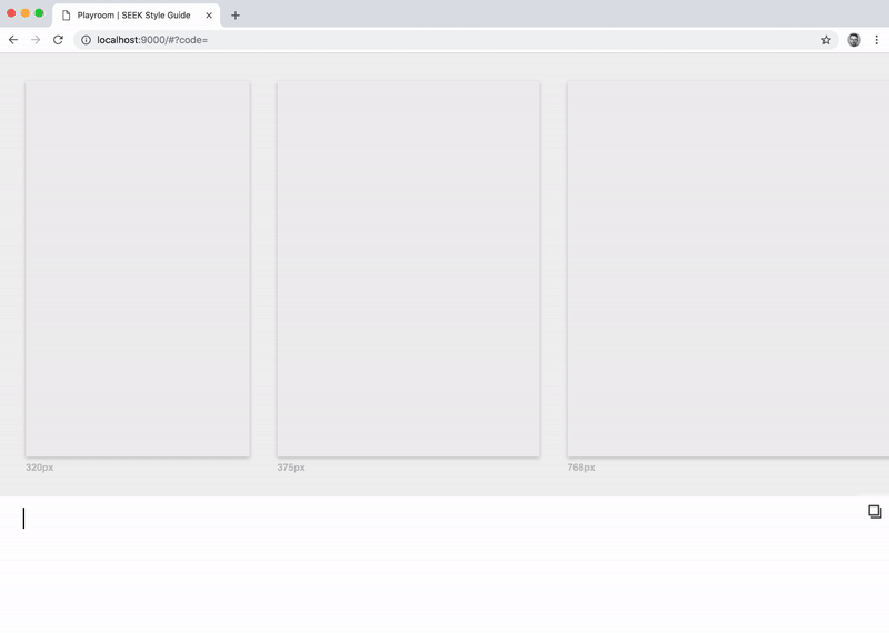
This is why we've included a Playroom integration with this starter (and because it's actually really easy to do with the way kickstartDS is set up) at playroom.config.js.
There's some configuration in Storybooks .storybook/preview.js, and all components that should be enabled need to be added in src/playroom/components.ts. We also added Bedrock Layout Primitives support out-of-the-box, there.
To change the included Snippets edit src/playroom/snippets.ts, and to change the theme integration (or even to add multiple themes / white-label testing capabilities to it) have a look at src/playroom/FrameComponent.tsx and the folder src/playroom/themes.
Finally, TypeScript support for all your (and our kickstartDS base) components is also already configured. This enables auto-complete for all components, making it really easy and playful to discover components and their properties!
Start your Playroom:
_10yarn playroom
Combined use with Storybook
You can even use Playroom in your Storybook as an addon, just be sure start Playroom before starting Storybook. Because you guessed it: it's already set up!
Bundling
With this starter we want to cover the complete life-cycle of a Design System. This includes Bundling and Release handling. We also want to show what we mean when we say kickstartDS is framework-agnostic.
Because you can either use a Design System based on kickstartDS by working with React templates directly, or by alternatively using CSS and JavaScript bundles to be used with the raw markup generated by components... both cases are covered in this starter.
It's also quite common for both types of usage to coexist for your Design System. Your main marketing page might be built with a headless CMS and a modern stack using React, while some arcane internal tooling might still use PHP for its templating. This setup enables you to serve both!
All bundling is handled by the dist:* tasks in package.json.
Bundling for HTML usage
CSS bundling with Dart Sass is done by the dist:sass script in package.json. Just be sure to add all needed component CSS to src/dist.scss, the compiled output will live at dist/index.css.
JavaScript bundling with esbuild is done by the dist:js script in package.json. As with CSS, be sure to add all needed component JavaScript to src/dist.js, the compiled output will live at dist/index.js.
Next to all that configuration, as a start the included "Integration" Story describes this process to potential developers using your Design System this way.
Bundling for React usage
Consumable React component versions are bundled by dist:components in package.json. This also uses esbuild under the hood, for details about its implementation see scripts/bundleComponents.js.
Release handling
Release handling for this starter is configured to use auto, and its semantic versioning. We use this setup for kickstartDS itself, you can learn more about it in our documentation.
Configuration is added in .autorc, and if you want to enable releases as part of your CI / CD... you can use Circle CI with the included configuration file at .circleci/config.yml.
We will probably expand on this section, when we have a better picture of everyones setup and needs!
Visual Regression Testing with Chromatic
One of the relatively undocumented features is Visual Regression
Testing
with Chromatic. This is prepared to be
usable with yarn chromatic
(also compatible with CI / CD) in package.json.
Content
We've described all the features extensively now. To wrap up this README let's quickly summarize everything included from a "content" perspective: Components, Pages, Recipes and Docs.
Components
As described in the very intro to this README, all the included components should be immediately useful in pretty much every Design System, but they're also specifically used to showcase features and best practices at play in kickstartDS, and to make it easier for you to just add stuff to an already working, well-oiled system:
Recipes
We added one recipe to give you an idea on how you could use those. We've added an ArticleTeaser recipe, as one entry in the more general Article recipe category.
Recipes are useful to show how your existing components can be re-used, re-mixed and re-applied to new use cases, avoiding the creation of many specialized components. They serve as great inspiration for consumers of your Design System, while also slightly nudging in a certain direction by the examples you decide to showcase!
Pages
There is one Page currently included with this starter in src/pages/Demo.story.jsx, added to Storybook by src/pages/Pages.stories.jsx.
Docs
There are two docs pages (the Welcome page and the Integration page), and documentation for all token from your Design Token set, included with this starter. Feel free to add further docs pages to your Design System in docs/.
Scripts
Short descriptions for all of the scripts entries in package.json:
| Script | Link | Description |
|---|---|---|
build-storybook | Features > Storybook integration | Compile Design Token set first, run sass, sass-manager and schema in parallel, before finally starting the default storybook build script |
build-tokens | Features > Design Token integration | Compile Design Token set according to sd.config.cjs |
chromatic | Features > Release handling | Run Visual Regression Tests with Chromatic |
dist:components | Features > Bundling > Bundling for React usage | Build all the components for React usage |
dist:fonts | Features > Bundling | Copy static/fonts to dist/ |
dist:iconsprite | Features > Bundling > Bundling for React usage | Copy IconSprite.js to dist/ |
dist:images | Features > Bundling | Copy static/img and static/logo.svg to dist/ |
dist:favicons | Features > Bundling | copy static/favicon to dist/ |
dist:sass | Features > Bundling > Bundling for HTML usage | Build CSS using Dart Sass |
dist:schema | Features > Bundling | Process JSON Schema files, copy result to dist/ and run tsc to generate TypeScript types |
dist:js | Features > Bundling | Build component JavaScript using esbuild |
init-tokens | Next steps > Customizing Design Token | Initialize Design Token set using src/token/branding-token.json |
playroom | Features > Playroom integration | Start all watch tasks before starting Playroom |
playroom:start | Features > Playroom integration | Starts Playroom in watch mode |
playroom:build | Features > Playroom integration | Builds Playroom for deployment |
prepublishOnly | Features > Release handling | Runs before publishing a release, resets dist/, compiles your Design Token set and then runs all dist:* scripts in parallel |
sass | Features > Storybook integration | Compile CSS for use in Storybook (when not bundled for distribution) |
sass-manager | Features > Storybook integration | Compile CSS for Storybooks manager, enables the light theming capabilities added |
schema | Features > Storybook integration | Run all the schema:* entries in parallel |
schema:dereference-schemas | Features > Storybook integration | Dereference JSON Schema, to inline all references ($ref) to make consumption (e.g. in Storybook Controls) easier |
schema:generate-props | Features > Storybook integration | Generate TypeScript types based on your component API |
start | Getting started (in 5 minutes) | Start everything in watch mode, and then start Storybook in watch mode, too |
storybook | Getting started (in 5 minutes) | Alias for default Storybook start script storybook dev |
token | Features > Design Token integration | Extracts Component Token from component CSS / SCSS, so they can be displayed in our addon |
watch:sass | Features > Storybook integration | Compile CSS for use in Storybook in watch mode |
watch:sass-manager | Features > Storybook integration | Compile CSS for Storybooks manager in watch mode |
watch:schema | Features > Storybook integration | Run all the schema scripts in parallel, when a JSON Schema changes |
watch:token | Features > Design Token integration | Compile Design Token set and extract Component Token when a tokens CSS / SCSS file changes |
watch:dictionary | Features > Design Token integration | Compile Design Token set when a Style Dictionary file changes |