#tldr: in this post I’ll try to provide some background info on the power of kickstartDS components. They are especially powerful once customized to your brands corporate design. They come with lots of options, so you don’t need to either invent or deal with limitless variants like in other frameworks. You can even specify or limit design variations based on different token sets or across multiple brands or layers.
Great components!
Make the most out of your frontends by unifying their core – utilizing component and design tokens
is what we wrote once on our homepage.
What does that mean?
In kickstartDS components are designed to be the foundation of your design system. That is the reason we put all our experience into building base components containing the most used variants, without blowing up the complexity with a multitude of unneeded options right from the get-go.
We rely on design and component tokens, which are already regarded as a standard by most, when talking about design systems. You can easily use our base set of components to assemble any page layout for all content-driven frontend. Every component in kickstartDS comes with its own options. These options help you to configure the basic settings. For example: if you use a component containing a headline, you can easily configure the alignment, headline-level and more. Since experienceable documentation is very important to us, you can utilize the Storybook ‘Controls’ panel to test and preview all possible changes.
Check out the following clip for a micro-example:
This already is pretty cool and helpful! You can try it out on your own in our live Storybook.
But it gets even better when digging deeper into the “Section” component from the clip before. You can configure the complete look’n’feel, like deciding on the background color and decorative patterns for the section in question. Always in compliance with the rules and limitations formalized by your own design system:
I hope you start to see where we’re coming from, when we’re talking about great components. And what you youself could expect to enjoy when working with our components. Especially how well-curated component options, connected with carefully chosen design and component tokens, give you a nice expressive workbench… all while providing safety, by keeping you inside set (design system) guard rails in regards to branding and consistency.
Getting back to the documentation part: the JSON Schema we write as part of every kickstartDS component, used to e.g. make the components configurable in Storybook, also helps to provide a base layer of options for you to connect to the headless CMS of your choosing. Placing all these powerful options in the hands of your editors and content creators!
But that is something we’ll shine the spotlight on in another, dedicated blog entry.
Let’s instead take a look at one more example, a mighty component included with our design system starter kit:
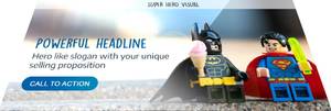
The hero visual 🦸
A hero visual usually is an oversized banner image that is placed in the top section of a website. It is immediately prominent and catches the user’s attention at a first glance. Oftentimes it promotes the unique selling proposition, and contains the main call to action of the page.
In comparison to other frontend frameworks, you should really only need one visual component to be the hero of all of your touch points. Adapting to all your needs while still keeping it simple. For us that is the “Visual” component.
Tailwind UI, as one counter-example, offers 9 ready-made components for the hero layout alone. With kickstartDS you don’t need that much of a selection. And thinking Design System-wise you shouldn’t want or need that many options, either (“but… which one should I use?”). You want to provide one set of design rules to apply for all hero image-type usage. Once this is set up, each editor can decide on his own on what is the best way to promote his content, always staying in compliance with your brand guidelines and promoting overall consistency. This is just one more example of what differentiates our components, making them a great experience for all parties involved.
More brands, more logos, more colors, all ruled by the same components
Most companies own subsidiaries and hence have a real need to care about multiple brands, including all necessary design and layout related decisions. Here, too, you can rely on the kickstartDS base components, customized to match your major brands design. Starting with those as a foundation and layering additional decisions on top in a controlled and measured way, down towards even your smallest sub-brand … using a different set of colors, fonts or shapes. We call this multi-brand theming and design system layering.
As with those aspects of centralized design rules mentioned in the section about the hero visual, by using kickstartDS all components really do share one common, reusable core. You can declare design tokens for each of your brands within a layered instance of kickstartDS. You or your DesignOps team can specify which component for which brand should be based on the core components, or instead be fully customized for that specific use case… keeping it from polluting the (shared) core. This balance of flexibility and efficiency when dealing with multiple variations of your design system will be the final example of this post, detailing what we think makes components great.
Do you agree that those are important parts of what makes a great component? Please let me know what you think?!
btw: as we are super convinced by the component tokens principle… we even wrote our own Storybook addon (to inspect and interact with said tokens in a dedicated Storybook panel) which you can download and use for free! 🤗


