#tldr: In this post I’d like to demonstrate how easy it can be to kick off your own Design System, by just applying some design tokens, and adding a sprinkle of customization, using kickstartDS. And as we’ve had some recent projects combining Sanity.io and Sanity Studio as the headless CMS, Next.js as the static site generator, and of course kickstartDS for the frontend, we thought: Might be a nice idea to simply re-build the Sanity.io landing page, as a showcase. So strap in and follow along!
Creating the template in React
The base structure was assembled rather quickly, by combining existing layouts and components. React in combination with a proper component library proved to be a really efficient combo here:
Theme and Style application
In the first step, I wanted to apply some basic style attributes that will roughly dictate the look and feel of the page. I consider this a stepping stone, to establish a first path which further token application can continue down further.
I asked myself: do I want something catchy with large fonts and lots of white space? Or do I need a slightly more dense experience, that uses spacing more efficiently, and focuses on delivering information?
Have a look at the screenshot below, to get a feel for how this looks:
Token application
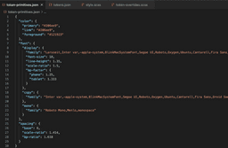
With all those macro design decisions out of the way, I could now move on with customizing the individual token values, which got generated for me from the theming input I defined before. This is where structured tokens can make or break a Design System. You want a clear and concise purpose for every base level token.
What part of what component will be affected by this, seemingly insignificant, change I am making?
It is important that this is conveyed through the semantic naming of each token.
After configuring the token file for about two hours, the page was already remarkably close to the actual Sanity.io landing page:
This is great news, because so far I haven’t even had to customize a single line of code. I’ve just reused the existing structure to adapt a completely new design!
Token overrides
As seen, up until this point I could easily apply tokens without making any real design decisions, the Design System already made those for me, in a sensible and time-saving manner. However, a couple of components were still differing quite a bit from their real-world Sanity.io counterparts. This is mostly due to them having a different intention in this specific design application.
A quick example:
Let’s say you need a Teaser Box component that is supposed to really catch the attention of the user. However, kickstartDS intends Teaser Boxes to be more of in-page navigational elements. Following this intention, the Teaser Box by default has tokens that are supposed to generate muted background colors. If you want to change the background color to a more intense color, you should pick a new token representative of your intention. In this case we need a background color that is intended to signal interaction, so a good pick would be something like:
--background-color-interactive
Within this step, I’ve also integrated some of the foreign (to kickstartDS) components into my new Design System. At that point the pages were starting to look almost identical… I had to re-check the URL to make sure what page I was on 😉
Customization
If you want to step outside the foundational layer of design tokens automatically available to you, and get really creative with your styling, you can always just as easily customize the components more directly. I used this to adjust the remaining minor differences the two pages still had. These were details you probably wouldn’t even notice, if you were casually checking the page. But I still decided to adjust them.
Et Voilà, I’ve got my very own Sanity.io landing page, fully responsive and entirely done in kickstartDS. And a matching Design System to boot 🚀
All it took was:
- a couple of hours of work,
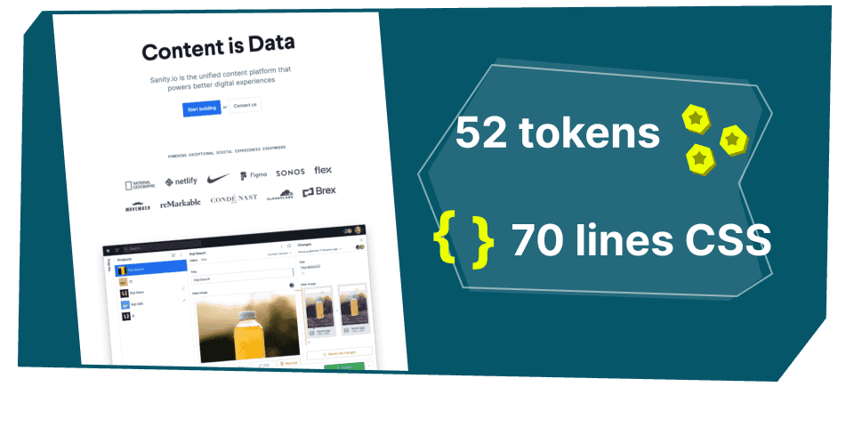
- 58 token overrides and
- 70 lines of CSS
Check out the resulting page for yourself: https://bit.ly/3uGievY
And for reference, the original: https://www.sanity.io/
Wouldn’t it be nice to now also get a free, ready-to-use headless CMS integration for our newly created page, too? Start to customize with a nice, focussed editor interface… starting to build out our website? If only we had such a miraculous solution… and I wonder what headless CMS vendor would fit such a descrition 😏
Btw, did I mention? There’ll be a part 2 to this… tell us your guess on what that could possibly entail, for example on Twitter!


