Anatomy
Component driven development
We strongly follow component driven development:
https://www.componentdriven.org/
Overview of layers
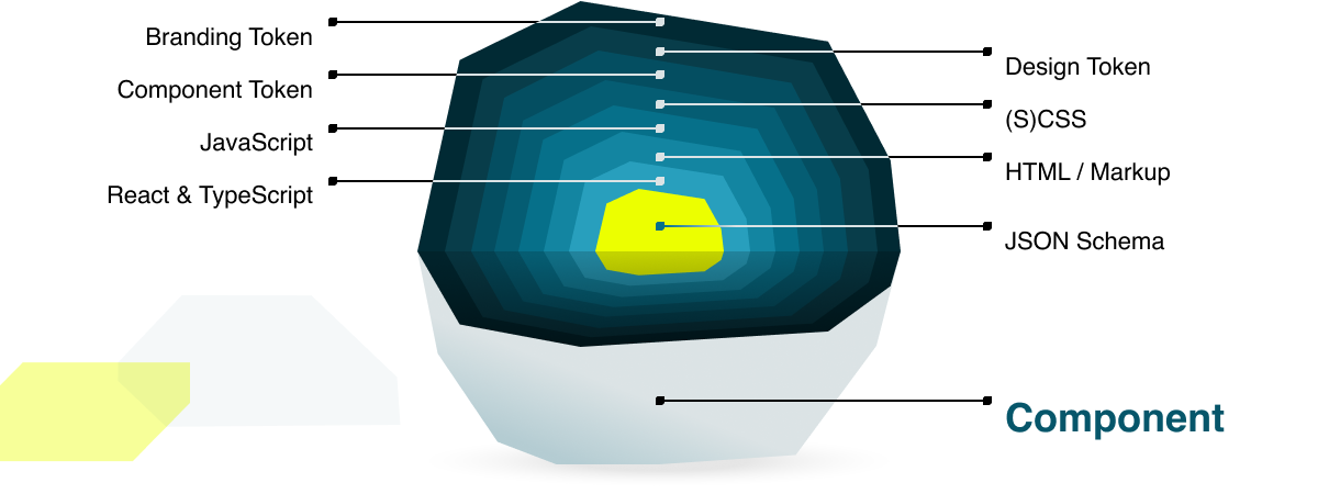
Different layers:
- Branding Token
- Design Token
- Component Token
- (S)CSS
- JavaScript
- HTML / Markup
- React & TypeScript
- JSON Schema
Branding Token
Branding Token are the most basic, and high-level, elements influencing a component. As they were used to initialize your Design Token, they will also be mapped into your Component Token and thus influence how your component will look.
Design Token
Generated by Branding Token these act as inputs, to be converted and used in your Component Token to break down Design System rules into component rules to re-use.
Component Token
Component Token map your Design Token set and your semantic token to your components in layers. Variants and variations are layered on base variants, allowing for easy customization while always having great defaults as a baseline.
(S)CSS
Component styles are written in SCSS and named following the BEM methodology.
To prevent class name collision, kickstartDS component class names are prefixed with c for content components or l for layout components.
Container Queries
All components are fully responsive. Because we don't know where they will be used, we don't use media queries, but container queries.
For browsers that do not yet natively support container queries, we provide a narrow polyfill.
JavaScript
Most components are pure and do not require additional JavaScript in the client.
For interactive components, a JavaScript module is loaded separately. This module is written in vanilla JavaScript and works with any frontend framework and even without a framework.
Initialization
kickstartDS uses Mutation Observer to initialize components when they appear on the page.
A component script is a JavaScript class with the static property identifier. A component with the HTML attribute ks-component="{identifier}" is then initialized with the appropriate class.
Lazy loading
Component scripts are loaded only when the component is on the page or dynamically added.
You can go further and load the script only when the component scrolls into the viewport by simply adding the lazyload class to the component.
Event-Handling
Components can communicate with each other via a PubSub event bus.
Anyone can participate in the event bus; it is publicly available at window._ks.radio and can therefore also be used to communicate with the "outside world" or to send events from outside into components.
HTML / Markup
Markup is the normalizing factor, it's what ultimately defines what a component looks like in the browser. We use React as a templating language to write templates, but they generate HTML in the end... and as our JavaScript / TypeScript is written outside of React, you can easily use kickstartDS in HTML, or by adding it into your legacy backend / code-base (for example PHP, .NET, etc).
You could also re-implement components in another templating layer like Vue.js or Angular, as long as the resulting HTML stays the same, and the component API is followed.
React & TypeScript
Although kickstartDS components are basically framework agnostic, each component is also shipped as a fully typed and ready to use React component.
JSON Schema
A component can have multiple options that affect its appearance. These options (or props) are defined in JSON Schema and form the component API.
_16{_16 "$schema": "http://json-schema.org/draft-07/schema#",_16 "$id": "http://schema.kickstartds.com/base/divider.schema.json",_16 "title": "Divider",_16 "description": "Dividers bring clarity to a layout by grouping and dividing content in close proximity.",_16 "type": "object",_16 "properties": {_16 "variant": {_16 "title": "Style of the divider",_16 "type": "string",_16 "description": "Choose a variant for the divider",_16 "enum": ["default", "accent"],_16 "default": "default"_16 }_16 }_16}
JSON Schema is a common and widely used format to describe (and validate) data structures and can be easily converted to other formats (such as TypeScript types, Storybook stories or Sanity schemas). kickstartDS uses the component schemas e.g. for generating the React prop types.